
Why Use Power BI for P&L Reporting?
- Visual clarity: Replace static spreadsheets with interactive charts and slicers.
- Real-time insights: Refresh data from Xero and Excel with a click.
- Custom branding: Tailor dashboards to your business identity or client needs.
Xero Reports Required:

- Account Transactions
- Chart of Accounts
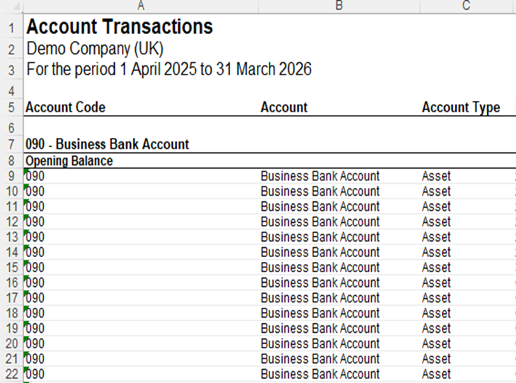
Account Transactions Report
Step 1: Extracting the Account Transactions data from Xero to Excel:
Manual Export:
- Log into Xero and select the company
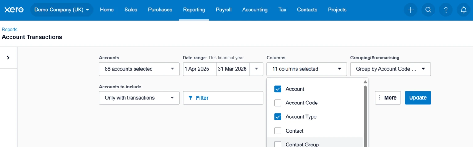
For this guide, we will be referring to the Demo Company (UK) - Locate to the Reporting tab and select Account Transactions
- The below should be displayed as:
• Accounts: Select all accounts
• Date Range: This Financial Year (adjust accordingly)
• Columns: 12 Columns selected
• Grouping/Summarising: Group By: Account Code & Name
- Re-order columns to your preference
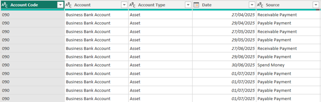
Here is the example of columns which has been used to extract the data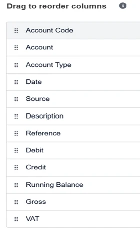
- Export the report and save the file as an Excel Workbook
Chart of Accounts Report
Step 2: Extracting the Chart of Accounts data from Xero to Excel:
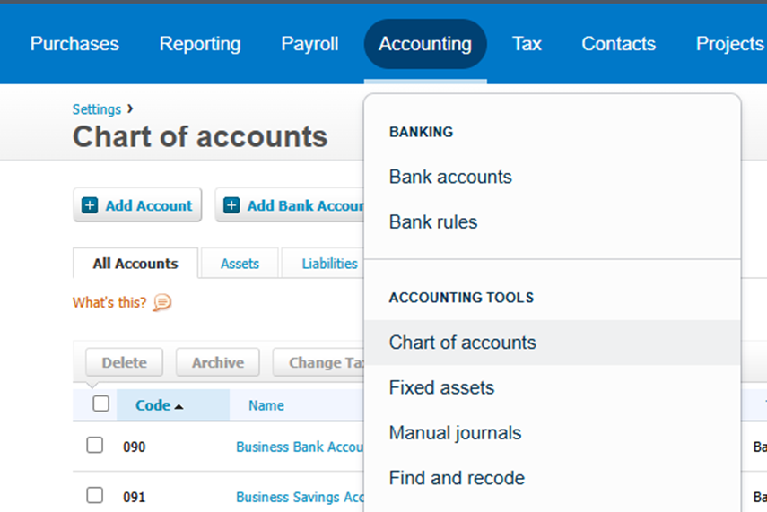
- Navigate to the Accounting tab
- Underneath Accounting Tools select Chart of Accounts
- Export the report and save the file as an Excel Workbook
Step 3: Importing data from Excel to Power BI:
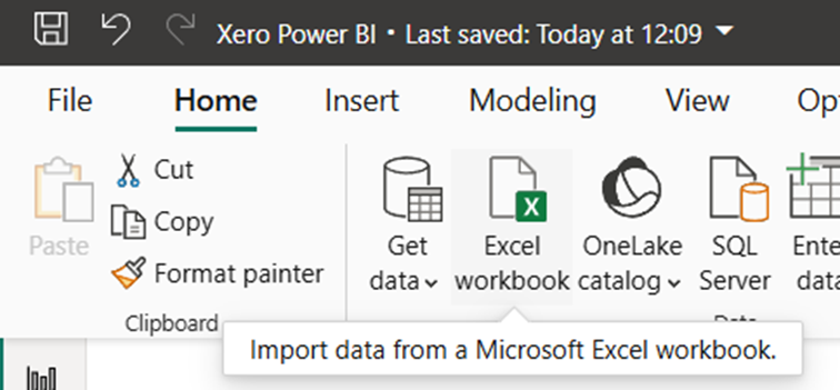
- Open Power BI and navigate to Get Data
- Select the dropdown bar and select Excel Workbook for Account Transactions
- Select Load Data
- The data table should be visible in Power BI
- Repeat these steps for importing the Chart of Accounts file
Step 4: Data Cleansing in Power Query
When you first import the file, it imports with all the header rows and sub totals
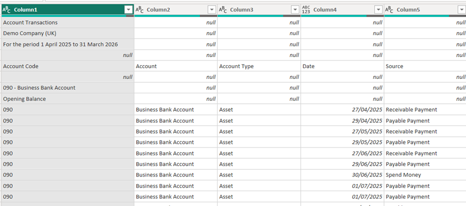
We will remove these to make it into a clean reporting table
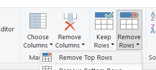
Step 1 – Remove top rows
remove the top 4 rows
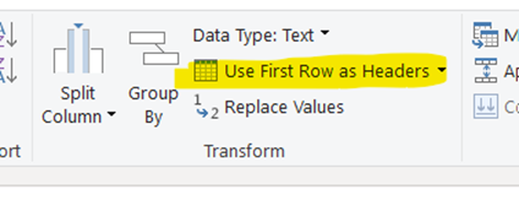
Step 2 – Use first row as headers
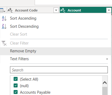
Step 3 – Remove empty (spacer) rows
We now have a nicely formatted table.
Step 5: Creating the relationship of data in Power BI:
Now all the data is accessible in Power BI, we need to connect this together.
- Navigate to Model View on the left-hand side of the Power BI screen
- Select Manage Relationships and New Relationship
- From table: your_account_transactions_table
To table: your_chart_of_accounts_table
Cardinality: Many to one (*.1)
Cross-filter direction: Single
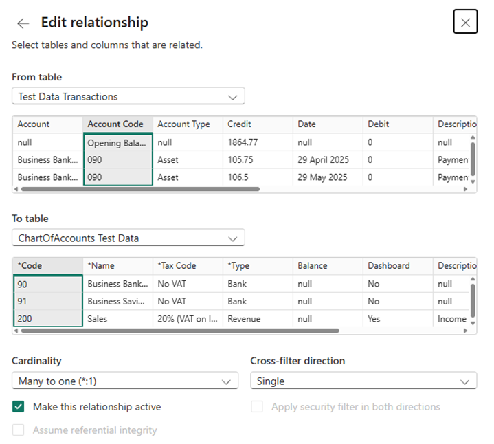
Ensure that the Account Code Column and Code Column is selected for you to create this relationship
Converting Debits and Credits to a clearer value
Us accountants can be a strange bunch!
By default, Sales show as credits (Negative), and expenses as Debits (Positive)
We want to change this to make the reporting much more intuitive, so we will create a calculation which checks the type of account and presents in an understandable way

Step 6: Creating a column to calculate the value:
- Open the Table View on the left-hand side of the Power BI screen
- Locate to Table Tools and select New Column for the Account Transactions dataset
- New Column Name = Value
Now look at your chart of accounts to see how the coding works, in our example all of the P&L codes are in the range below 600
So we will only change those

Custom Column Formula = if [Account Code] < 600
then ([Debit] – [Credit]) * -1
else (Debit] – [Credit])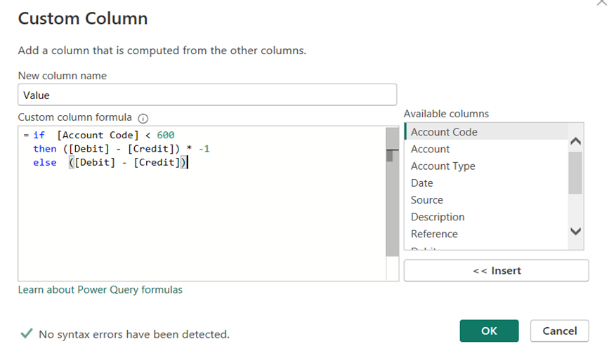
Step 7: Organising account type sort order:
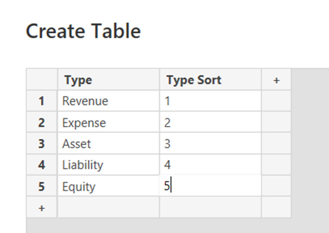
Create a new table
1. Name of table: Account Type Sort
Enter Data
2. Two columns: Type & Sort
3. Rows underneath Type: Asset, Expense, Liability, Revenue
4. Rows underneath Sort: Apply a numbering system for the layout of a P&L & Balance Sheet
5. Load the data
Step 8: Creating the relationship of Account Type Sort data
We need to be able to connect the new data table to the account transactions.
- Navigate to Model View on the left-hand side of the Power BI screen
- Select Manage Relationships and New Relationship
- From table: your_account_transactions_table
To table: your_account_type_sort_table
Cardinality: Many to one (*.1)
Cross-filter direction: Single
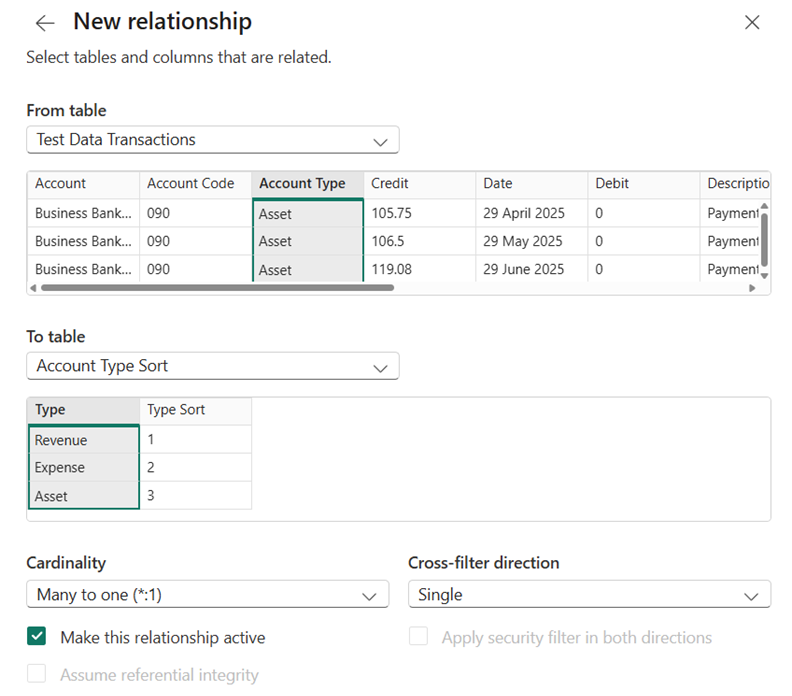
Ensure that the Account Type Column and Type Column is selected for you to create the relationship
Step 9: Building the P&L dashboard in Power BI :
In Report View
- Select the Matrix Table from Visualizations
- Rows:
Type (From ‘Account Type Sort’ table)
Name (From ‘Chart of Accounts’ table) - Columns:
Date (From ‘Account Transactions’ table)
Month - Values:
Sum of Value - Apply basic filtering: Select Revenue & Expense
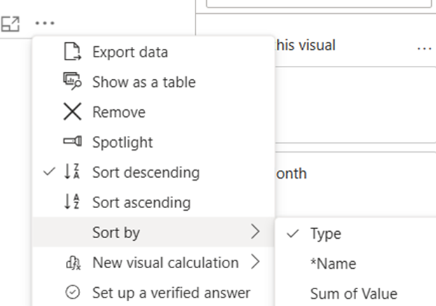
- Sort this visual by: Type
Power BI Dashboard Example:
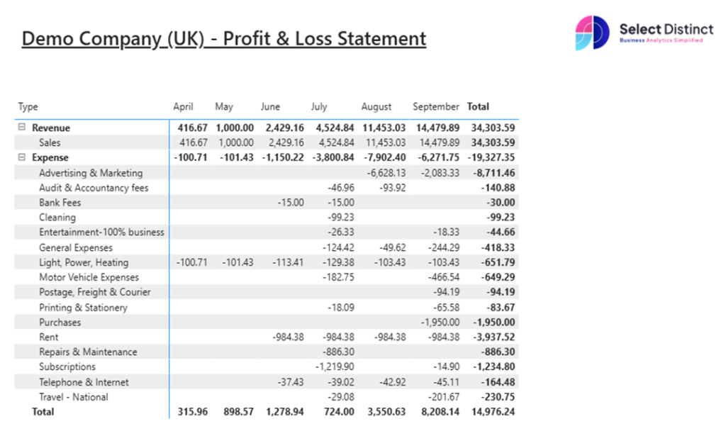
To check the P&L balances in Power BI works, check this against the Profit & Loss Report in Xero
Extra step: Adding more visuals to the Power BI dashboard:
- Design the visuals:
- Add Bar/Column charts for trend analysis
- Use Cards for key metrics like Total Revenue, Net Profit & Profit Margin
- Add Slicers:
- Filter by Month, Account Category
- Branding:
- Use the company brand palette colours
- Add the company logo to the dashboard
Final Thoughts:
Creating a P&L dashboard in Power BI isn’t just about numbers, it’s about clarity, trust, and empowering better decisions.
Having the ability to create the reporting the way you want to see it can be really powerful for you.
Ready to build smarter financial reports?
If you have any questions on this or any other topics, please get in touch.
Next Steps?
Learn the terminology in our Power BI Glossary
Watch our Xero to Power BI Tutorial
Explore more of our How-To Guides
 loading="lazy"