
Dashboards are a great way to present the data your audience needs to know. But, if they done wrong, they can do more harm than good.
This best practices guide for creating dashboards walks you through the key steps to consider when designing a dashboard.
Key Points for an Effective Dashboard:
- Keep it simple yet informative
Avoid clutter while ensuring the dashboard conveys meaningful insights
- Make it easy to understand and act upon
Your audience should quicky grasp the message and act on recommendations
- Build iteratively with user feedback
The best dashboards evolve through collaboration and continuous refinement
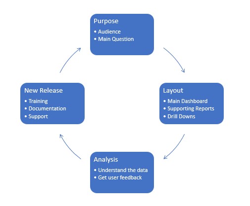
We call this having a P.L.A.N.
Purpose, Layout, Analysis and New Release, this cycle ensures that the dashboard is fit for purpose and continues to be as the needs of the end user may change over time
Know your audience, ensure that the information presented to the user is relevant and thoroughly understood.
For example, a CEO will be likely wanting a high-level overview, whereas a HR manager will tend to be focussed on people, skills and training.
Types of Dashboards
Types of data and understanding their nuances is a prime factor
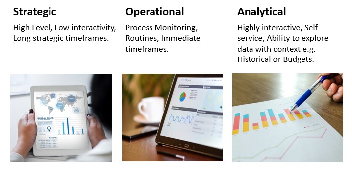
This image illustrates the three contexts of business intelligence:
- Strategic
- Operational
- Analytical
Each defined by its level of interactivity, decision-making timeframe, and data usage purpose.
Types of Data
Types of data and understanding their nuances is a prime factor.
- Categorical/Nominal:
Named items, with no relative values
Examples: Countries, People, Departments
- Ordinal
Named items that have a value-based order
Examples: Premium, Standard, Budget or
- Quantitative
Items that have a measured value
Examples: Sales (£), Prices, Time
Use Appropriate Charts
Recommended Charts
Bullet Graph – Horizontal type gauge, more space efficient

Bar Graphs – Great for comparatives, space efficient
Stacked Bar Chart – Combine headline view with a breakdown into categories
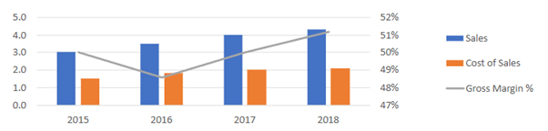
Combination Bar and Line – Show individuals values and trend using the line at the same time
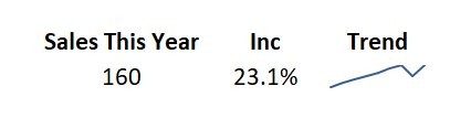
Sparklines – Compact, space efficient, gives a general trend feel, some context and used to decide whether to look in more detail
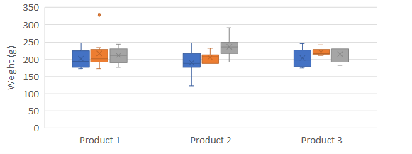
Box Plots – Present distribution of data around a median, with upper and lower values, e.g. defect rates
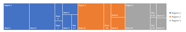
Treemaps – Space efficient way of breaking down a hierarchy by values, to prompt further exploration in more detail
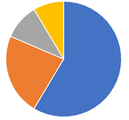
Pie Charts – Show breakdown of the whole, but NOT space efficient compared to bar charts, stacked bar charts.
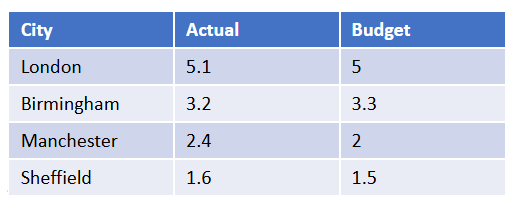
Tables – Often clear way to present data than a chart
Maps – Useful to measure geographic data, which can be difficult to see in any other way.
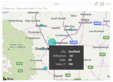
The example shows sales cannibalisation in Sheffield from a new store opening in nearby Rotherham.
Best Use of Space
Space is a significant limiting factor in dashboard design, but not all space is created equal, the human eye is drawn to specific areas more than others
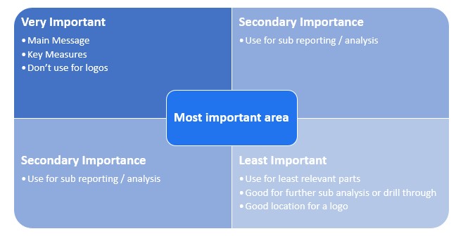
This image illustrates that it is like reading left to right, top to bottom based on importance.
When Dashboards Overwhelm Instead of Inform
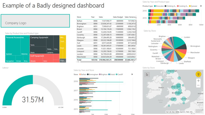
This dashboard includes sales, budgets, labour costs, and more but it’s hard to take in.
There’s no clear flow, and the layout is too busy to read quickly.
Instead of guiding the user, it overwhelms them.
A Case Study in Clutter
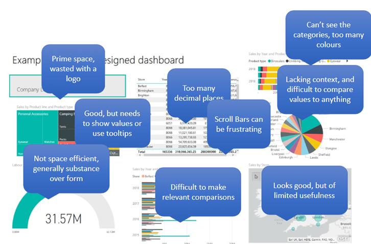
Avoid These Dashboard Design Pitfalls
- Fragmenting Data
- Lack of Context
- Over Elaboration
- Too many decimal places
- Using too much space for little data value
- Too much clutter
- Unnecessary graphics
A Dashboard That Provides Clarity
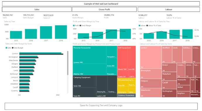
This dashboard is easy to navigate, with clearly defined sections that guide the viewer from left to right.
The clean layout and minimal clutter make it easy to absorb key insights at a glance.
Dashboard Design Best Practices: A Final Recap
Before you build, step back and plan.
The most effective dashboards aren’t well-designed they’re purpose built.
Dashboard Design Checklist
- Have a Plan
Define the goal of your dashboard before you start designing.
- Know Your Audience
Tailor the layout, metrics and visuals to their needs and decision-making style.
- Choose the Right Type of Dashboard
Strategic, operational, or analytical — each serves a different purpose. - Understand Your Data Types
Know what you’re working with: categorical, time-series, financial, etc. - Use Appropriate Charts
Match chart types to the story you’re telling — avoid overcomplication. - Make the Best Use of Space
Prioritize high-value insights and avoid wasting prime real estate. - Refine with User Feedback
Dashboards should evolve. Test, iterate, and improve based on real user input.
Explore more insights using our Business Analytics Blog