Ever spent time perfecting your column widths in Power BI, only to watch them snap back to default the moment you refresh or interact with a slicer?
You’re not alone — and yes, there’s a fix
In this post, we’ll walk through how to lock column widths in Power BI tables and matrices, so your branded layouts stay consistent and client ready.
The Problem: Auto-Resizing Columns
By default, Power BI tries to optimize column widths based on the data it displays. While this sounds helpful, it often leads to:
- Misaligned visuals after a refresh
- Inconsistent spacing across pages or bookmarks
- Broken commentary blocks or branded overlays
- Reduces readability for short labels or icons
If you’ve ever had a dashboard “jump” when switching slicers, this is likely the culprit.
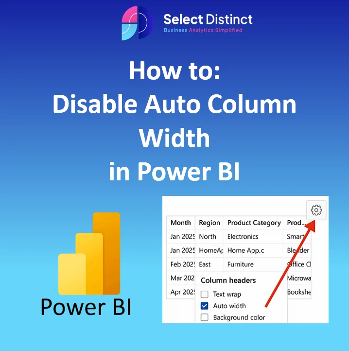
The Fix: Disable Auto Column Width – Step-by-Step
Step 1: Select your visual (table or matrix)
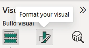
Step 2: In the Visualizations pane, click the Format icon (paint roller)
Step 3: Expand the Column headers section

Step 4: Expand the Options section

Step 5: Toggle the Auto-size width to ‘off’
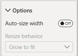
You can now manually resize each column by dragging the edges.
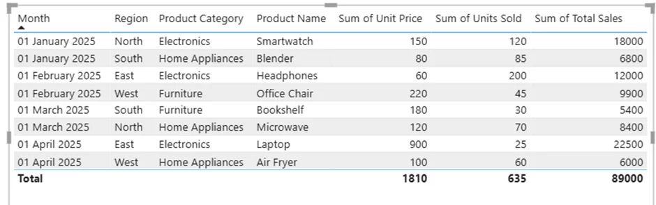
Example and How To Disable
Why This Matters for Branded Dashboards
Disabling auto column width helps you:
- Maintain consistent layout across bookmarks and pages
- Align commentary blocks with financial metrics
- Prevent layout shifts that confuse non-technical users
- Create space for branded visuals, icons, or modular commentary
Bonus: Locking Layout with Bookmarks
If you’re using bookmarks to toggle views, make sure to:
- Disable auto column width before creating bookmarks
- Resize columns manually, then update your bookmark
- Test layout consistency across slicer states
This ensures your dashboard feels intentional, not reactive.
Final Thoughts
Column width auto-resets might seem like a minor annoyance, but in client-facing dashboards, consistency is everything.
By disabling auto-size and manually setting your layout, you protect the clarity, alignment, and branded polish your visuals deserve.
Whether you’re presenting a Profit & Loss breakdown or guiding SME clients through liquidity insights, small formatting tweaks like this reinforce trust and make your dashboards feel intentional — not accidental.
Want cleaner, more consistent visuals in Power BI?
Visit our Dashboard Design & BI Tools for layout and formatting tips
For walkthrough guides visit our YouTube Channel