
When you’re working with real‑world data, the raw numbers only tell part of the story. Whether you’re analysing sales, expenses, customer behaviour, or operational performance, the real insight comes from seeing how values are distributed — not just what the totals look like.
That’s where grouping and binning in Power BI come in. These features make it easy to turn detailed, granular data into clear and meaningful patterns. And once your bins are set up, you can take the analysis further by adding a cumulative frequency distribution to show how values build up across the different ranges.
This post breaks down what these tools do, why they’re useful, and how you can apply them to make your Power BI reports clearer, more intuitive, and far more insightful.
What Are Grouping and Binning?
Grouping
Grouping lets you combine categories into logical clusters.
For example:
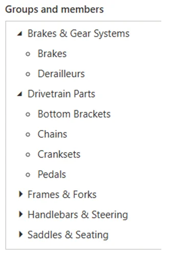
- Merging several product types from “Other Components” into a more detailed subcategory’s
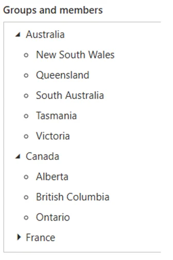
Grouping individual State‑Province entries into broader country‑level categories
It’s ideal when you want to simplify long lists or tidy up inconsistent categories

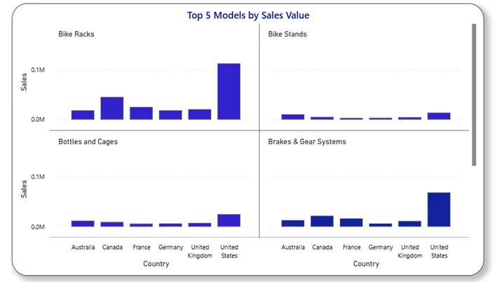
How the Group Looks When Used in a Visual
Breaking these out from ‘Other Components’ allows us to surface meaningful differences between product types and gives a more accurate picture of category performance across regions.
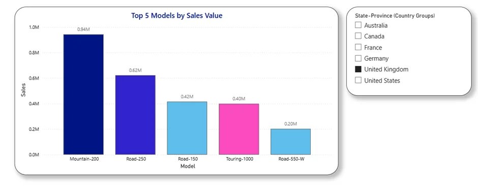
This chart shows how the Country group can be used to filter the report, with the grouped field limiting the view to sales for the United Kingdom only (or other countries).
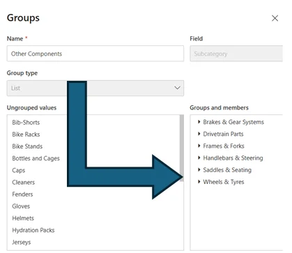
How to Create a Group in Power BI
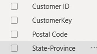
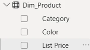
Step 1 — Choose the field you want to tidy
Select a categorical column such as product type, region, or state‑province.
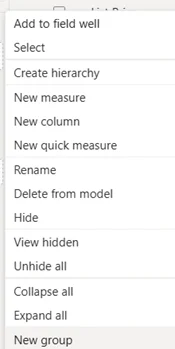
Step 2 — Create the group
Right‑click the field → New Group
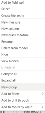
Step 3 — Select items to group
In the Ungrouped values list, highlight the items you want to combine → click Group
Examples:
- Combine several small product types into Other Components
- Group individual state‑province entries into Country buckets
Step 4 — Name your group
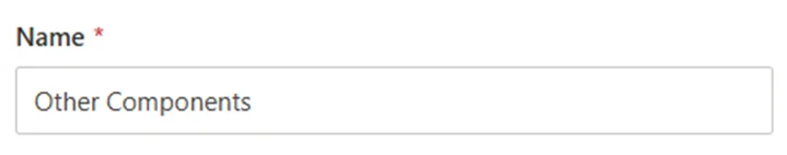
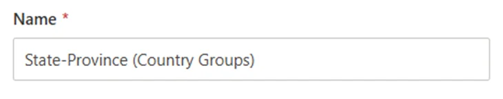
Give the new group a clear name such as Other Components (Groups) or State‑Province (Country Groups)
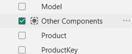
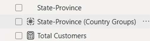
Power BI creates a new field you can use in slicers, visuals, and hierarchies.
Binning
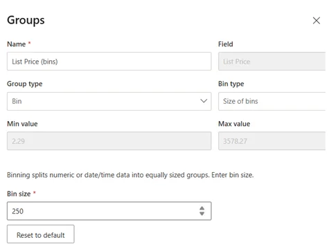
Binning creates numeric ranges
for example: Bin Size 250
This gives you ranges like:
- £0–£250
- £250–£500
- £500–£750
- £750–£1,000
- …and so, on up to £3,500+
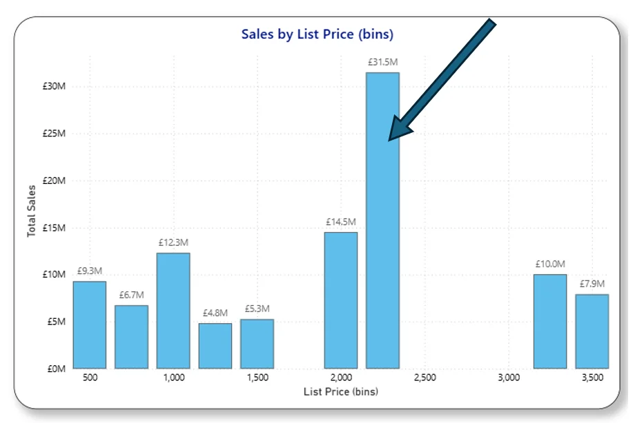
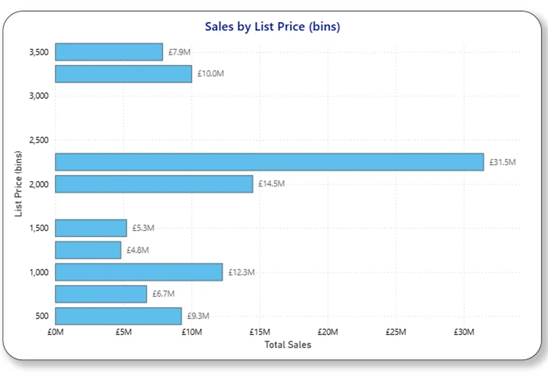
How Binning Looks When Used in a Visual
This visual shows how much sales value comes from products whose list price falls into each bin.
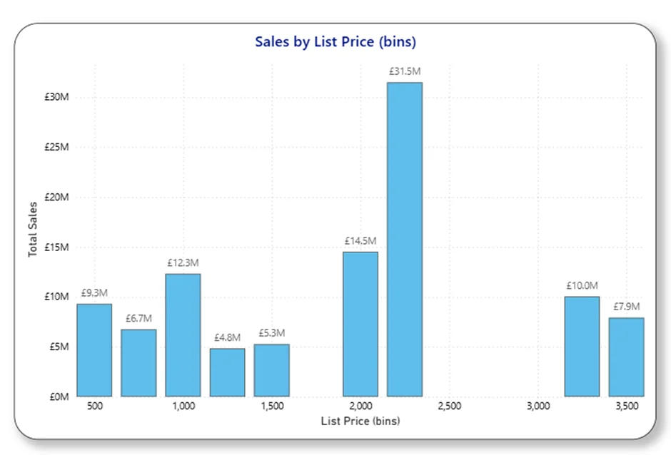
Power BI automatically assigns each record to the correct range, giving you a structured view of how your values are distributed.
Binning is especially useful when you want to:
- Build histograms
- Identify clusters or gaps
- Spot outliers
- Understand typical value ranges
- Prepare for cumulative analysis
Why Binning Matters
Raw numbers can be overwhelming. Binning helps you answer questions like:
- Where do most of my values sit?
- Are there many small items or a few large ones?
- Is my data tightly grouped or spread out?
It’s a simple way to reveal the shape of your data — something totals alone can’t show.
For example: “By binning our list prices, we can quickly see that most of our sales come from products priced around £2,500, with much smaller totals in the lower price brackets.
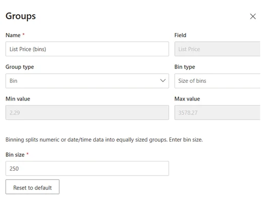
How to Create Bins in Power BI
Step 1 — Choose your numeric field
Select the column you want to analyse (e.g., sales amount, list price)
Step 2 — Create a bin
Right‑click the field → New Group → choose Bin
You can define:
- Bin size (e.g., £100 increments)
- Number of bins
Power BI creates a new field such as List Price (bins)
Step 3 — Add the bin to a visual
A column chart or bar chart works perfectly for a frequency distribution.
- Axis → your bin field (List Price – Bins)
- Values → Sum or count of your original field (Sum of Sales)
You now have a clear view of how your values fall across ranges.
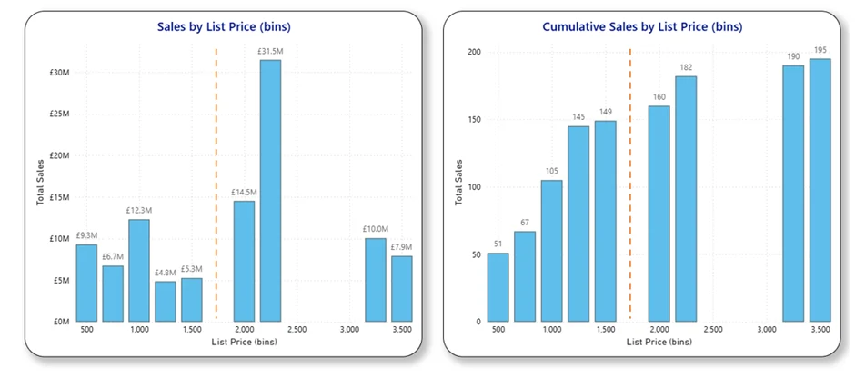
Optional: Add a Cumulative Frequency Distribution
Once your bins are in place, you can add a cumulative view to understand how values build up across the ranges.
A cumulative frequency distribution answers questions like:
- What percentage of expenses fall under £200?
- At what point do 80% of invoices accumulate?
- How quickly do values rise across the bins?
It’s a simple but powerful way to reveal thresholds and concentration.
Cumulative Frequency Measures
A basic cumulative measure
Cumulative Frequency =
CALCULATE(
COUNTROWS(‘Table’),
FILTER(
ALLSELECTED(‘Table'[Amount (bins)]),
‘Table'[Amount (bins)] <= MAX(‘Table'[Amount (bins)])
)
)
Cumulative percentage
Cumulative % =
DIVIDE(
[Cumulative Frequency],
CALCULATE(COUNTROWS(‘Table’), ALLSELECTED(‘Table’))
)
You can either add a cumulative line to your existing column chart or create a separate cumulative chart using the same measures to compare both views.
Comparing the Cumulative Distribution Across Price Bins
Tips for Cleaner, More Insightful Bins
- Keep bin sizes consistent
- Avoid too many bins (8–15 is usually ideal)
- Rename bins for clarity (e.g., “£0–£100”)
- Sort bins numerically, not alphabetically
- Add tooltips to show exact cumulative values
These small touches make your visuals feel polished and professional.
Final Thoughts
Grouping and binning are some of Power BI’s most underrated features.
With just a few clicks, you can transform raw numeric data into a clear, intuitive distribution. And if you choose to add a cumulative frequency distribution, you unlock an even deeper understanding of how your values build up across ranges.
Whether you’re analysing expenses, sales, operational metrics, or care‑home fees, these techniques help you move beyond totals and into meaningful insight.
If you’d like to explore more:
Head over to our Business Analytics Blog for insights, walkthroughs and scenario-driven guides
Or our Power BI Glossary for clear, beginner friendly definitions