
Smarter Visuals, Sharper Insights
In our previous post, we walked through building a Profit & Loss report from Xero in Power BI. Now it’s time to take that foundation and transform it into a dashboard that’s not only informative but intuitive, branded, and interactive.
Whether you’re presenting to stakeholders or refining internal reporting, these enhancements will help your dashboard speak louder and smarter.
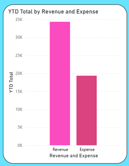
P&L Dashboard Before: Functional but Flat
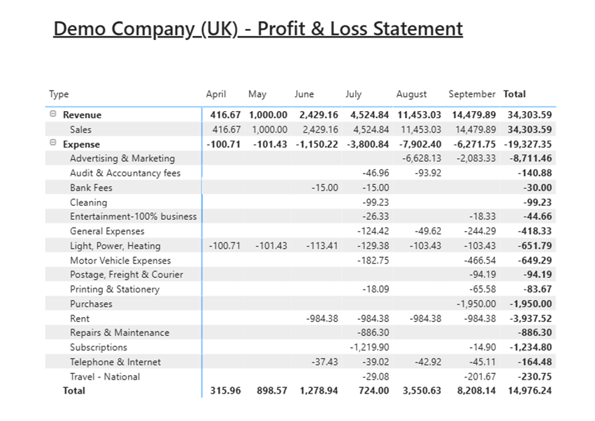
The current Profit & Loss dashboard is accurate but visually underwhelming. It lacks branding, cohesive colours, and interactive elements that guide users or highlight key insights. Without these enhancements, users must manually scan for trends instead of exploring them intuitively.
That’s why the next stage is all about elevating the experience, adding design polish, dynamic visuals, and interactivity that make the dashboard not just look better, but work smarter.
Visual Design: Make It Yours
1. Add Your Business Logo
Navigate to the insert tab, hover over the image icon and insert your chosen image so that you can:

- Place your company logo prominently.
- Position it top-left or top-right for brand recognition.
- Ensure it scales well across devices – test on desktop and mobile.
2. Apply Brand Colours
Extract colour codes from your logo and apply them consistently:
Colour Examples:
| Colour Name | Hex Code |
| Midnight Blue | #001484 |
| Royal Neon | #3122CC |
| Classic Rose | #DB4380 |
| Electric Pink | #FA4BBF |
| Warm Sky | #5FBEEB |
| Aqua Blue | #67E2FF |
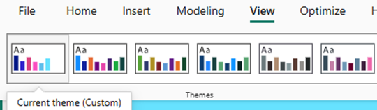
Or Custom theme in the view panel
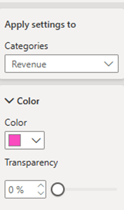
If you don’t already have a theme set, you can set the colours directly on a visual.
By selecting Format Your Visual Icon and locate to the column dropdown.
The categories dropdown allows you change each colour or select the colour to apply to all categories.
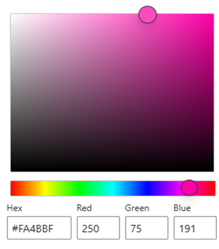
Enter your Hex value for your colour preference
Use these in:
- Chart bars and lines
- Card backgrounds
- Slicer headers and buttons
3. Rounded Borders
- In the Format pane, set border radius under “Shape” or “Visual Container.”
- Rounded corners soften the layout and modernize the look.
- Apply to cards, slicers, and charts for consistency.

P&L Dashboard Glow-Up: Brighter, Bolder, Better
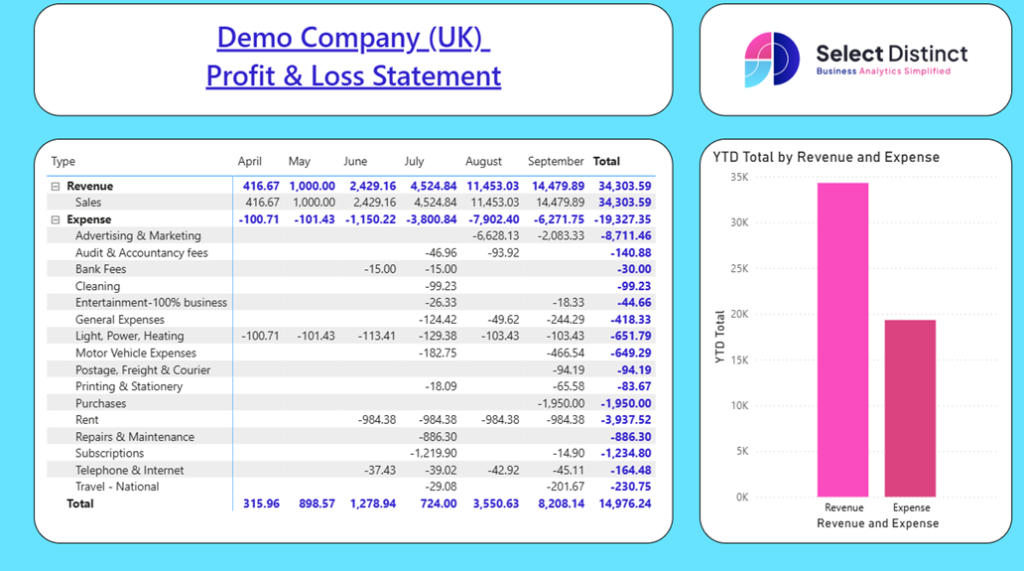
The dashboard transforms from static tables into a sleek, branded, and interactive experience that turns financial data into clear, actionable insight.
Expense Visuals: Chart Choices That Clarify
Transforming raw expense data into meaningful visuals is key to helping users interpret cost drivers, spot inefficiencies, and make informed decisions.
In this enhanced dashboard, we’ve selected chart types that not only suit the structure of the data but also elevate clarity and engagement.
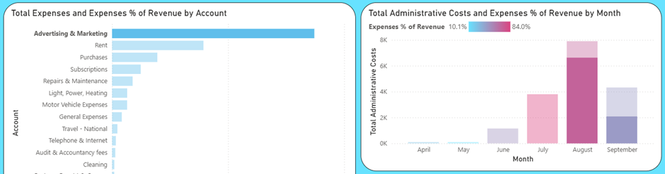
Horizontal Bar Chart: Total Expenses by Account
To build this visual, select the clustered bar chart and select the Total Expenses for the X-axis and Account for the Y-axis.
Why Choose a Horizontal Bar Chart:
- Ideal for long category names like Audit & Accountancy Fees, Printing & Stationery, etc
- Sort descending to highlight top spend areas – Marketing, Rent & Purchases
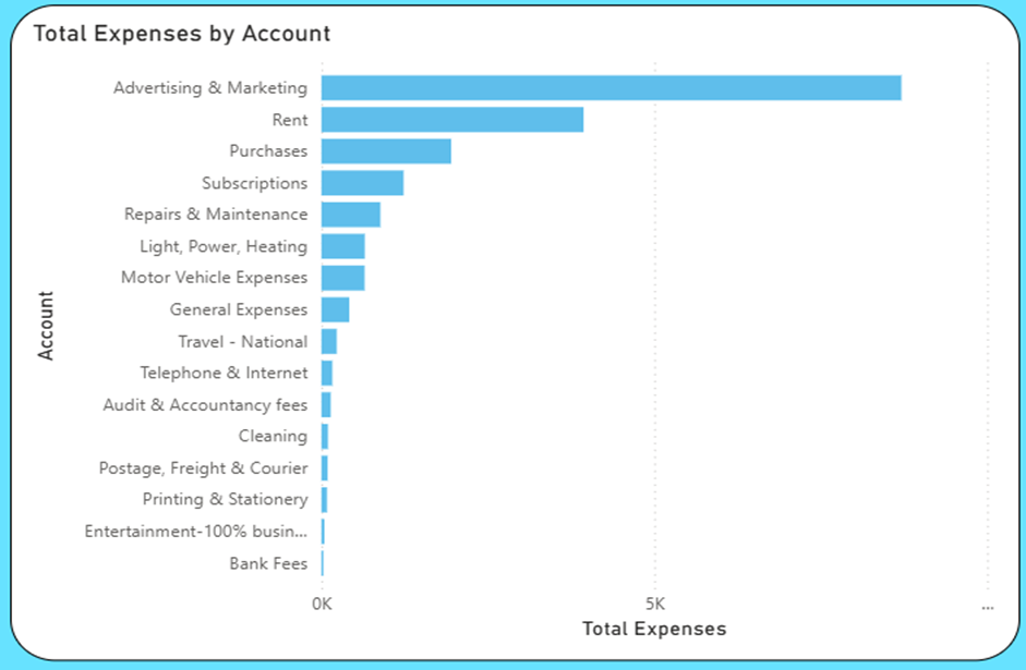
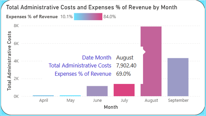
Add on: Using tooltips can show exact values and percentages
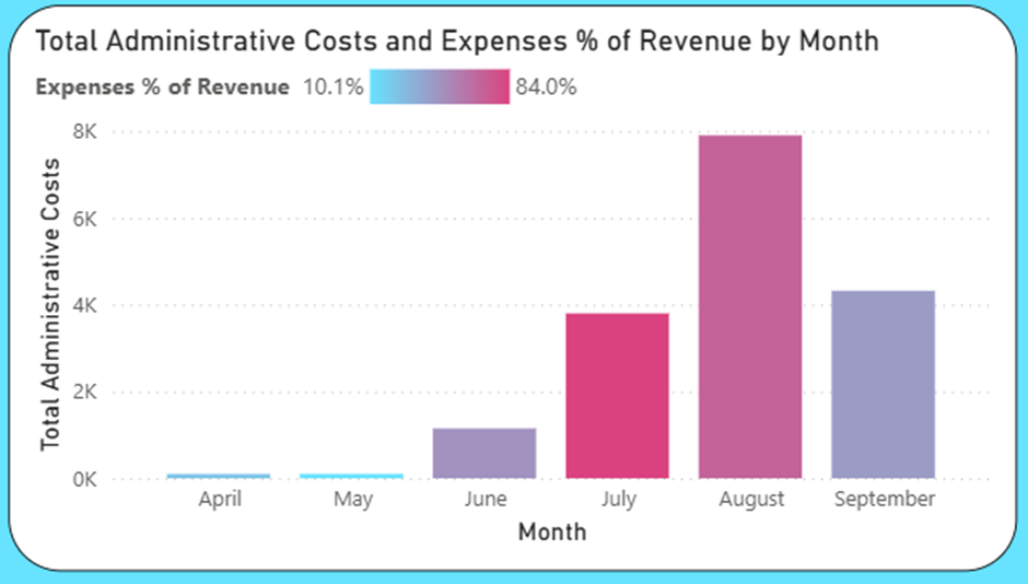
Column Chart: Administrative Costs by Month
To build this visual, select the clustered column chart and select the Date (Month) for the X-axis and Total Administrative Costs for the Y-axis.
Why Choose a Column Chart:
- Reveals monthly trends and spikes – August stands out as the highest
- Add data labels and consistent colouring for clarity
- Consider conditional formatting to flag outliers
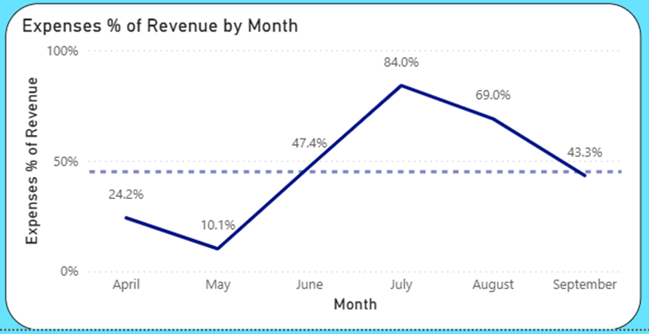
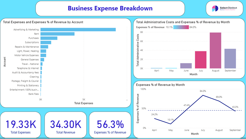
Line Chart: Expense % of Revenue
To build this visual, select the clustered column chart and select the Date (Month) for the X-axis and Expenses % of Revenue (see later in the blog for a breakdown of the DAX) for the Y-axis.
Why Choose a Line Chart:
Add a benchmark line (e.g. 45%) for context.
Tracks efficiency over time.
Plot months on the x-axis and percentage on the y-axis.
Highlight months like August (69.0%) where expenses exceed typical thresholds.
Interactivity: Let Users Explore
One of the best features of business intelligence tools like Power BI, is the ability to cross filter between charts
For example we can click on a bar in one visual, and the rest of the page can be set up to filter to the same data. This means that we can explore the data interactively allowing users to see a specific result, click and see how it looks over time and relative to other data such as revenue
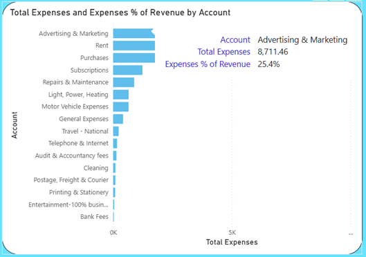
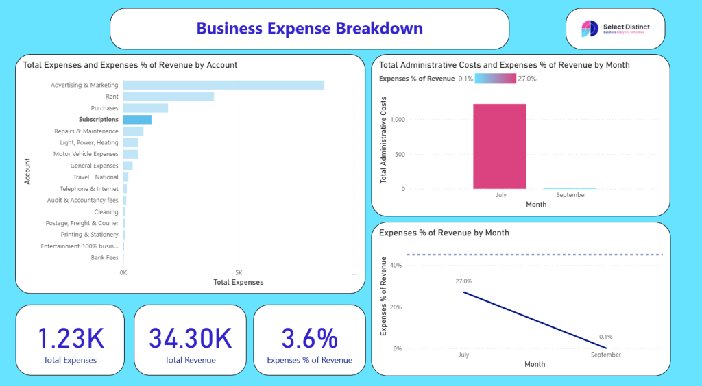
Focus on Advertising & Marketing
Want to drill into Advertising & Marketing spend by month? Use a slicer or filter pane to isolate this account. Or just click on the bar in the chart
By clicking the Advertising and Marketing bar on the top left, you see that the other two charts are updated to reflect the same. This immediately shows that the spend is in August and September and not in every month. We don’t have to leave the page to see this
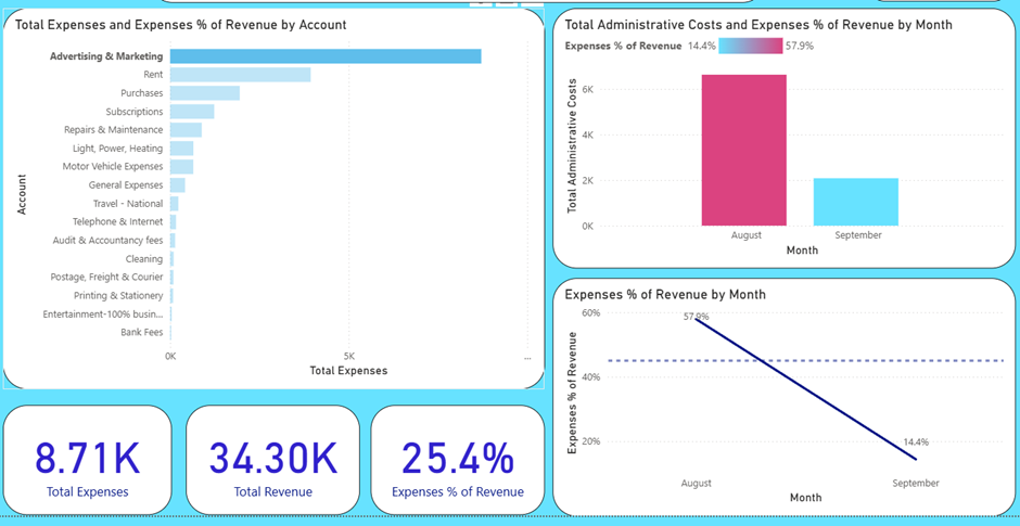
The cards at the bottom are also filtered to Advertising and Marketing showing the total expenses at £8.7k and this as a percentage of revenue overall at 25.4%
Edit Interactions: Filter vs Highlight
In the above example we have the interaction set to filter, but it can also be set to highlight
e.g. here is the same interactivity but changed to highlight, where the selected value highlights how much of the total it represents
To customize how visuals respond to slicers:
- Go to Format → Edit Interactions
- Choose:
- Filter: updates visuals based on selection
- Highlight: emphasizes selected data while showing full context
Use Filter for deep dives (e.g., isolating Marketing) and Highlight for comparative views.
Setting up measures in Power BI
(And why you need to)
Setting up measures in Power BI is a good idea, because they begin to simplify calculations, which once you start want to measures things such as Cost as a percentage of revenue then it is a lot easier and cleaner if the various pieces of the calculations are already measures
So, first of all we set up a measure for total expenses
Total Expenses =
CALCULATE(
SUMX(
FILTER(‘TD Transactions’, ‘TD Transactions'[Account Type] = “Expense”),
‘TD Transactions'[Debit] – ‘TD Transactions'[Credit]
)
)
This sums the debits less the credits, but only where the account type is an expense
We also have a similar one set up for Total Revenue
Now, if we want to calculate the Expenses as a percent of revenue then we can use the measures to create a new measure with those as the numerator and denominator
e.g. Expenses % of Revenue = [Total Expenses]/ [Total Revenue]
This would work fine for most cases
BUT…. If we want to filter down to an account code it would not work because the account codes on this page relate only to expenses.
To overcome this problem, we need to edit the Total Revenue part of this DAX formula to always return ALL the revenue regardless of which account is selected. By adding the ALL functions as below the measure will now calculate which ever expenses are selected and measure them against the whole revenue
Expenses % of Revenue = [Total Expenses]/(CALCULATE([Total Revenue], ALL(‘TD Transactions'[Account])))
This technique can easily be adapted to reflect revenue for the whole year by adding a date element to it, that is one for another post
The Final Output: A Dashboard That Delivers
The complete dashboard brings expense data to life, highlighting cost drivers, monthly trends, and efficiency in one clear, interactive view.
Data Observations / Explorations
With report now configured as we need it here are some example of how it can be used to fully understand what is behind the numbers
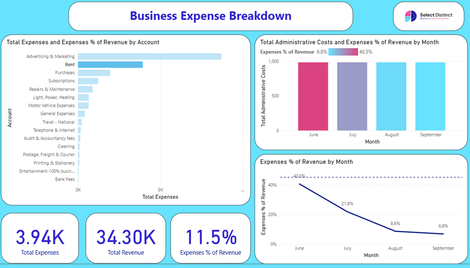
We covered advertising and marketing earlier, so lets look at the next biggest
Rent
By selecting rent, the top right chart shows that it is a fixed costs per month as all the bars are the same height, but the conditional formatting shows that as a percentage of revenue it was high in June and July, as the revenue was not established
Final Thoughts: You have seen how with a little set up you can go from flat spreadsheet types of tabular information, rich, engaging and flexible reporting that guides users through the data to see the impact
This ability is not exclusively for large organisations as all sizes of company from small business through to large enterprises can all benefit from the clarity that clean and clear reporting delivers
This dashboard has been created from a transaction export using Xero, you could easily replace this with your own Xero data or adapt it for any other accounting system export
If you have any questions on this or any other topics, please get in touch.
From setup to storytelling – our Power BI guides are written for real users, not just analysts. Learn what works, and why
How To Guides
Struggling with reporting, migration, or BI strategy? Our Power BI consultants offer hands-on help and flexible packages tailored to your business.
Here is an interactive online Power BI dashboard for you to explore
Microsoft Power BI
If you would like to download a copy of this Power BI template file send us an email asking for a copy and we will send it out to you
Next Steps?
Learn key formatting tips in our Power BI Glossary
Apply practical tips from our How-To Guides
For additional resources visit our Business Analytics Blog