From Data Sources to Dashboards
Power BI is one of the most widely used business intelligence platforms today, enabling organisations to transform raw data into actionable insights.
At its heart, Power BI revolves around three pillars: data sources (where information comes from), data modelling (how it’s structured and prepared), and dashboards (how insights are presented).
Understanding these pillars — and the tools that support them — is essential for anyone looking to master Power BI. Let’s explore each core concept in detail.

Power BI Desktop – The All-in-One Workbench
Power BI Desktop is the primary development environment and arguably the most important tool in the ecosystem.
- Data Sources: Desktop connects to hundreds of sources — from Excel spreadsheets and SQL databases to cloud services like Azure, Salesforce, and Google Analytics. Power Query provides a powerful interface for cleaning, shaping, and transforming data before it’s loaded.

Selecting the ‘Table View’ allows you to view the data that has been loaded into Power BI (from other sources)
- Data Modelling: Once data is imported, Desktop allows you to define relationships between tables, create calculated columns, and write DAX (Data Analysis Expressions) measures. This modelling layer ensures that your data is structured logically and consistently.
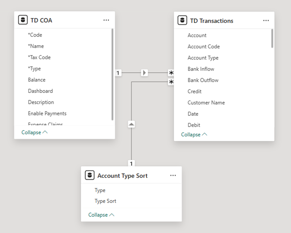
Creating relationships – allows multiple tables to be connected logically.
E.g. Account Type to Type so that (Revenue, Expense, Asset, Liability) can be matched.
And Account Code to Code so that nominal codes can join
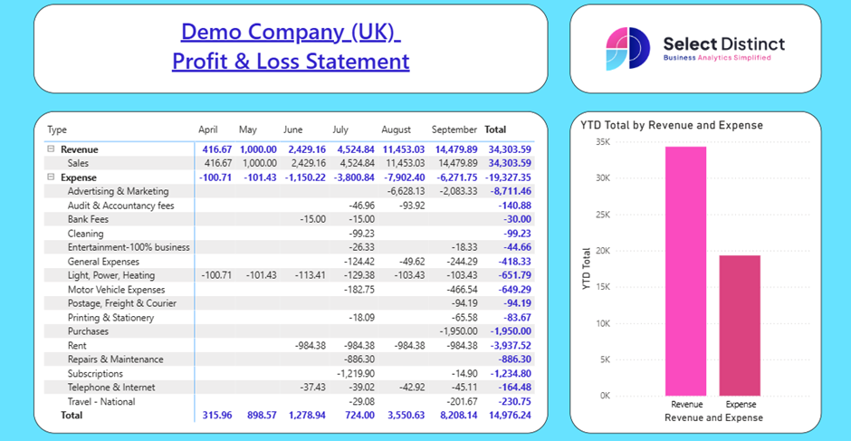
- Dashboards/Reports: Desktop is also where you design interactive visuals, slicers, and filters. Reports can be multi-page canvases; each tailored to different audiences or analytical needs.

Selecting the ‘Report View’ means you can view the report created.
Example: A finance team might import Xero data, model revenue and expenses with DAX measures, and design visuals to present a Profit & Loss statement. Once tested, the report is published to the Power BI Service for wider distribution.
Why it matters: Desktop is the “workbench” where analysts experiment, model, and design. Without it, the rest of the Power BI ecosystem has nothing to build upon.
Power BI Service – Collaboration and Distribution
The Power BI Service (app.powerbi.com) is the cloud hub where reports and dashboards are shared, consumed, and managed.
- Data Sources: The Service supports scheduled refreshes and live connections, ensuring that published reports always reflect the latest data.
- Dashboards: Unlike Desktop, the Service allows users to pin visuals from multiple reports into a single dashboard, creating consolidated views of KPIs.
- Collaboration: Workspaces, permissions, and deployment pipelines make it possible to manage content across teams, departments, and even entire organisations.
Example: A finance team publishes Profit & Loss dashboards to the Power BI Service. Executives and accountants log in daily to review revenue, expenses, and net profit, confident that the data from Xero is refreshed automatically.
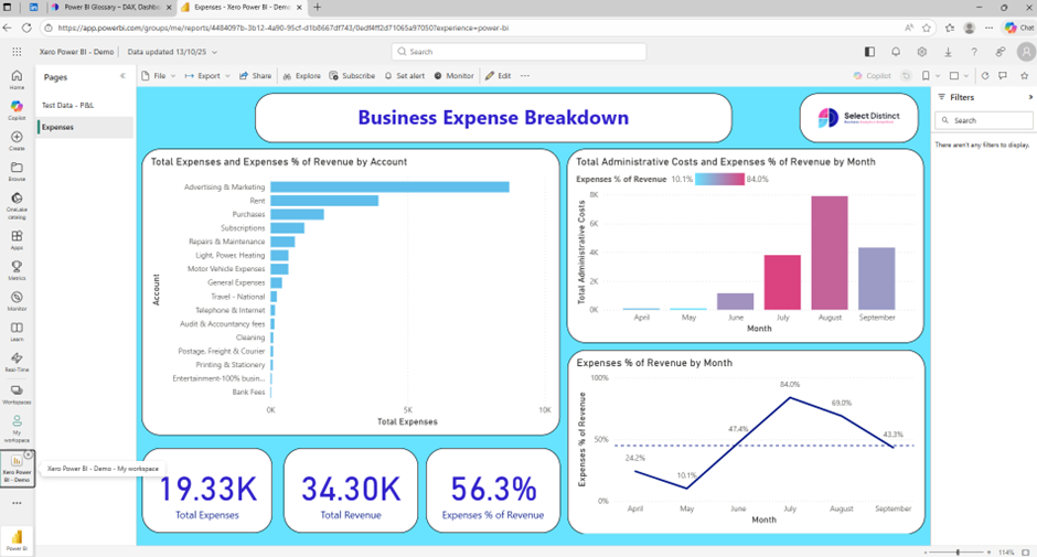
Why it matters: The Service transforms Power BI from a personal analytics tool into an enterprise-wide platform for collaboration and decision-making.
Power BI Mobile – Insights on the Go
Power BI Mobile apps (iOS and Android) extend the reach of dashboards and reports.
Dashboards: Optimised for touch, mobile dashboards allow executives and field teams to interact with visuals, drill down into data, and receive alerts.
Example: A finance team checks their mobile dashboard before a board meeting to review the latest Profit & Loss figures and expense breakdowns, ensuring they have up‑to‑date insights on revenue, costs, and margins.
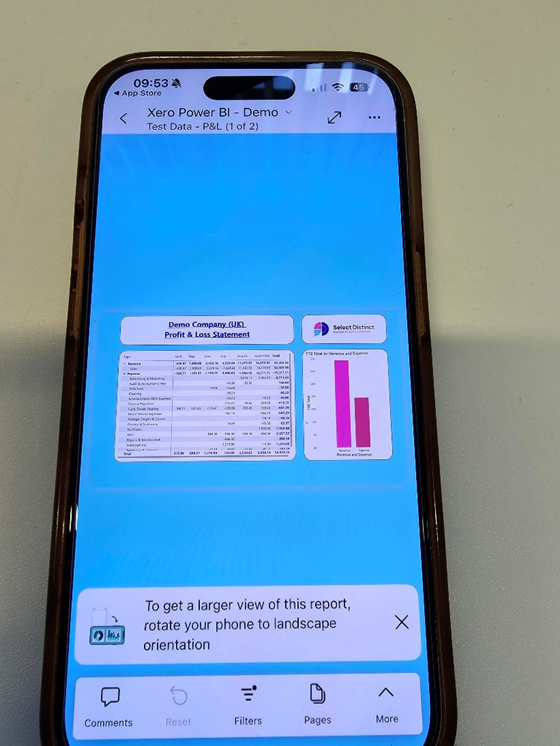
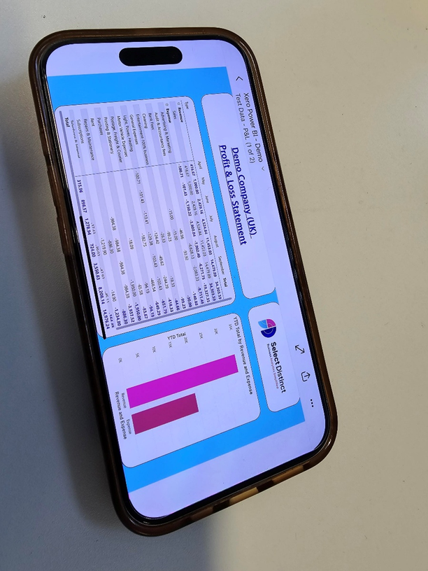
Presentation Tool: Mobile is less about building and more about consuming. It’s a presentation layer that ensures insights are accessible anywhere.
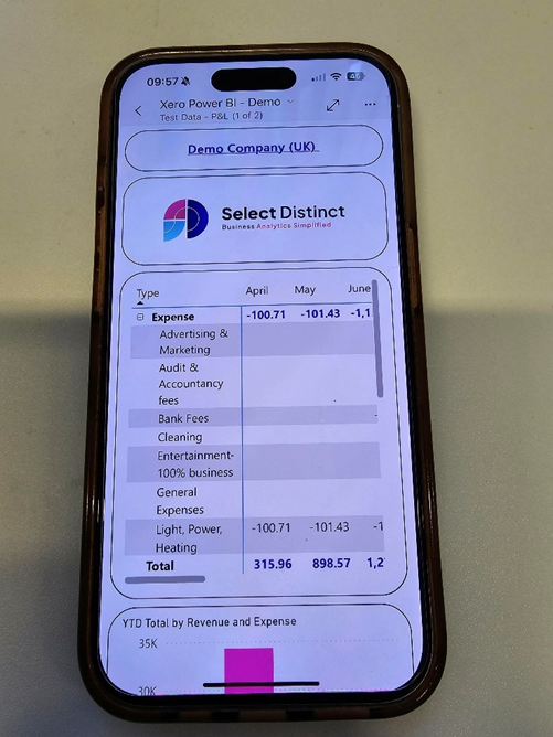
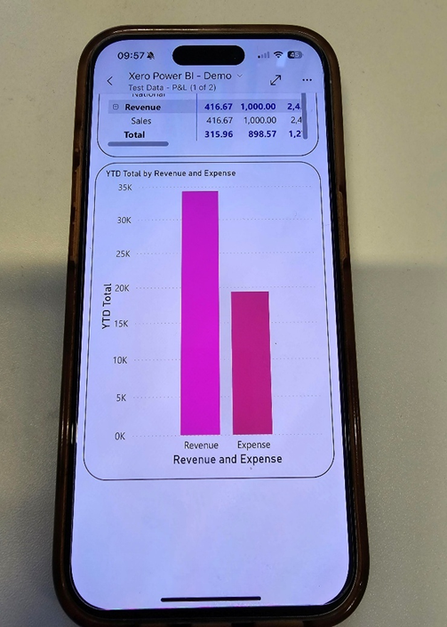
Why it matters: Mobile ensures that Power BI insights are not confined to desktops or offices. It’s about accessibility and agility.
Dataset — The Analytical Engine
Datasets are the foundation of reporting in Power BI.
- Data Sources: Datasets can be imported (stored in Power BI) or connected live via DirectQuery, which queries the source in real time.
E.g. Xero → raw accounting data (invoices, journals, chart of accounts).

- Data Modelling: They contain tables, relationships, measures, and calculated columns. This modelling layer defines how data is queried and understood.
E.g. Relationships between Accounts and Transactions, plus DAX measures for P&L lines (Revenue, Expenses, Net Profit) - Dashboards: Reports and dashboards are powered by datasets, making them the engine behind every visual.
Example: A dataset combining Xero accounting data with expense and revenue tables enables unified Profit & Loss reporting in Power BI, giving finance teams a single source of truth for monitoring margins, costs, and overall performance
Why it matters: Without datasets, reports and dashboards have no fuel. They are the structured representation of data that makes analysis possible.
Report — The Storytelling Canvas
Reports are multi-page canvases built on datasets.
- Data Modelling: Reports leverage the semantic model, using measures and relationships to drive visuals.
- Dashboards: Reports are the building blocks of dashboards, providing the visuals that can be pinned and consolidated.
Example: A finance report might include one page for overall Profit & Loss performance, another for monthly expense breakdowns, and another for department-level cost analysis — giving stakeholders a clear view of profitability across the business
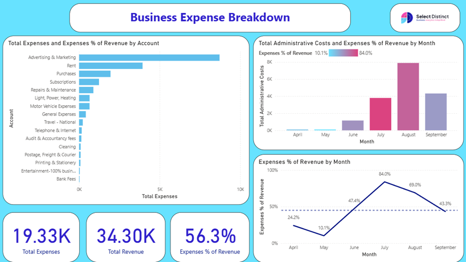
Why it matters: Reports are where data becomes a story. They allow analysts to explore, filter, and present insights in a structured way.
Dashboard — At-a-Glance Monitoring
Dashboards are single-page summaries available only in the Power BI Service.
- Dashboards: They consolidate visuals and KPIs from multiple reports or datasets into one page.
- Monitoring Tool: Dashboards are ideal for executives who need quick, high-level insights without diving into detailed reports.
Example: A finance director’s dashboard might show total revenue, expense categories, and monthly cost ratios pinned from different reports — helping leadership monitor profitability and spending trends at a glance.
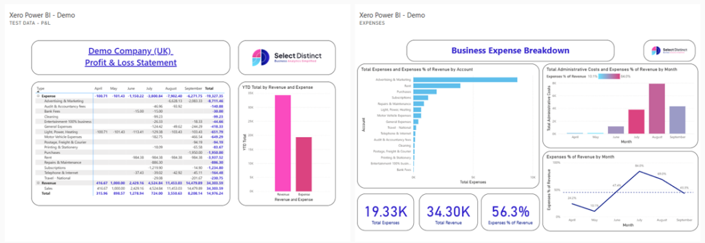
Why it matters: Dashboards provide clarity and focus. They are the “cockpit” for decision-makers.
Workspace — The Collaboration Container
Workspace are folders in the cloud that organise related content.
- Data Sources & Modelling: Workspaces store datasets and dataflows, ensuring consistency across reports.
- Dashboards: They also house reports and dashboards, making collaboration seamless.
Permissions and version control allow teams to manage content securely.

Example: Workspaces named Finance, Marketing, and Sales each hold their own datasets, reports, and dashboards — giving every team a dedicated space to manage, analyse, and share insights relevant to their function.
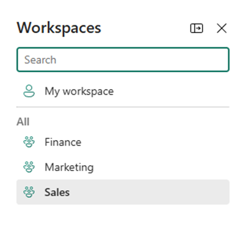
Why it matters: Workspaces are the organisational backbone of Power BI, ensuring that content is structured and accessible.
Dataflow — Reusable Data Pipelines
Dataflows are cloud-based ETL pipelines built with Power Query Online.
- Data Sources: They pull raw data into Azure Data Lake.
- Data Modelling: Transformations applied in dataflows can be reused across multiple datasets, ensuring consistency.
- Efficiency: Instead of cleaning data separately for each dataset, dataflows centralise the process.
Example: A company builds a dataflow to clean customer addresses once, then reuses it across sales, marketing, and support datasets.
Why it matters: Dataflows reduce duplication and ensure that transformations are consistent across the organisation.
Semantic Model — The Logical Framework
The semantic model defines how data is understood and queried.
- Data Modelling: It includes tables, relationships, measures, and metadata.
- Consistency: Measures defined in the semantic model can be reused across multiple reports and dashboards.
Example: A measure like “Gross Margin %” defined in the semantic model can be reused across different reports without redefinition.
Why it matters: The semantic model ensures that everyone speaks the same “data language.” It prevents inconsistencies and misinterpretations.
What is the difference between a semantic model and a data model?
Key Differences
| Aspect | Data Model | Semantic Model |
| Where it lives | Power BI Desktop (.pbix file) | Power BI Service / Fabric workspace |
| Audience | Report developer | Wider organisation (analysts, executives) |
| Reusability | Tied to one report | Can be reused across many reports/dashboards |
| Focus | Technical structure | Business-ready, governed layer |
| Example | Relationships between Sales and Products tables | Published “Finance Semantic Model” with P&L measures used by multiple reports |
Gateway — Bridging On-Premises and Cloud
Gateways connect on-premises data sources to the Power BI Service.
- Data Sources: They enable secure refreshes and live queries from local databases.
- Types:
- Personal Gateway: For individual use.
- Enterprise Gateway: For organisational use, supporting multiple users and sources.
Example: A hospital uses an enterprise gateway to refresh patient data from its local SQL Server into Power BI dashboards securely.
Why it matters: Gateways make hybrid data strategies possible, allowing organisations to leverage both on-premises and cloud data.
Final Wrap
By categorising Power BI’s core concepts into data sources, data modelling, and dashboards, we can see how each plays a distinct role:
- Data Sources: Dataflow, Gateway, Service connections bring information in.
- Data Modelling: Desktop, Dataset, Semantic Model shape and structure it.
- Dashboards: Reports, Dashboards, Mobile, Service deliver insights to decision-makers.
Together, they form a seamless pipeline from raw data to actionable intelligence. Mastering these concepts is the first step to unlocking the full potential of Power BI.
To read more about Power BI. Visit our Power BI Glossary
For additional resources. Visit our Business Analytics Blog

