Open‑Meteo is a free, open‑source weather API that provides:
- Current conditions
- Hourly forecasts
- Daily forecasts
- Temperature, wind, rainfall, cloud cover, and more
It requires no API key, so you can connect using a simple URL. That makes it perfect for beginners, demos, and lightweight dashboards that need live data.
Build Your API URL
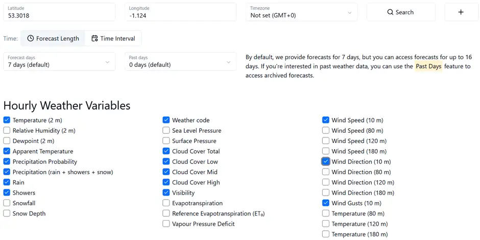
Open‑Meteo uses a simple query‑string format. You choose:
- A Location (latitude & longitude)
- The Variables you want (temperature, wind, rain, cloud cover, etc.)
- Time zone
- Whether you want Hourly or daily data
Here’s an example for Worksop:
https://api.open-meteo.com/v1/forecast?latitude=53.3018&longitude=-1.124&hourly=temperature_2m,apparent_temperature,precipitation_probability,precipitation,rain,showers,cloud_cover,cloud_cover_low,cloud_cover_mid,cloud_cover_high,visibility,wind_speed_10m,wind_direction_10m,wind_gusts_10m,weather_code

Phase 1: Connect Power BI to the API
Step 1: Create a Blank Query
In Power BI Desktop:
- Go to Home → Get Data → Blank Query
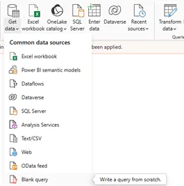
- Open the Advanced Editor
This gives you a clean slate.
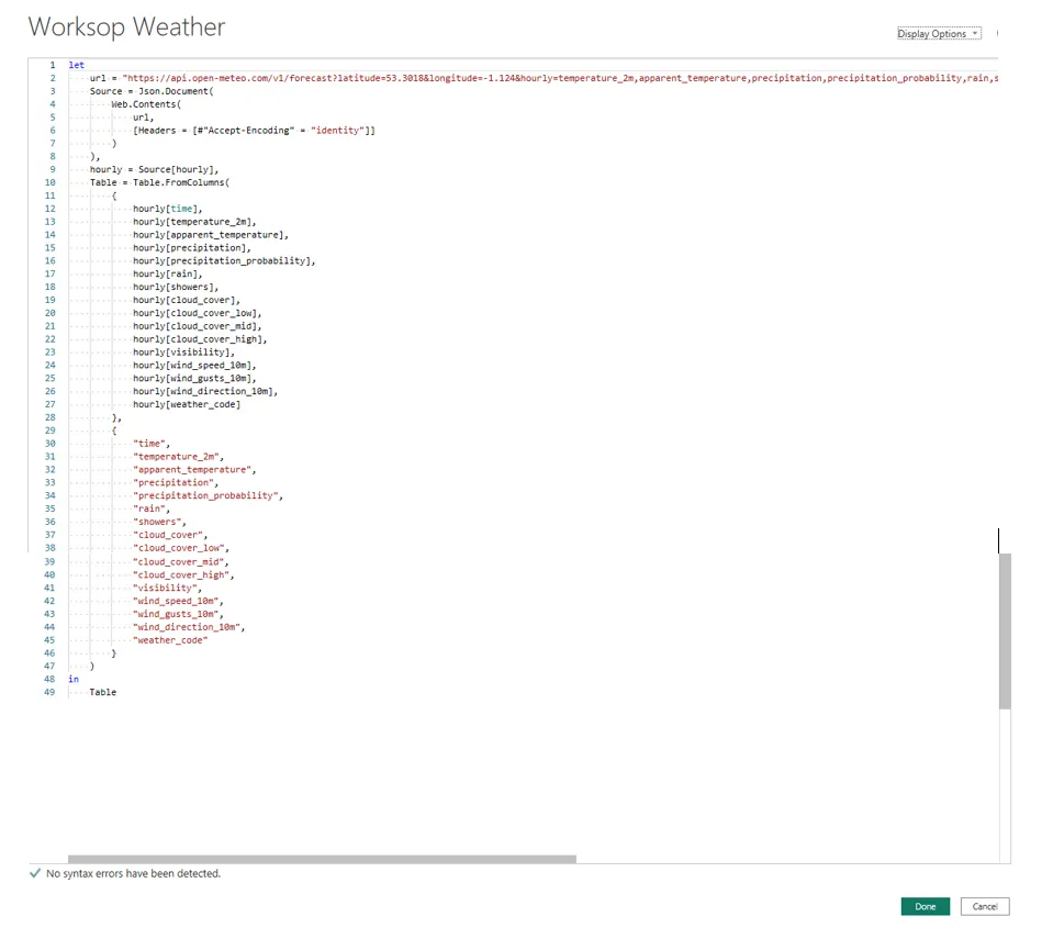
Step 2: Paste the Full Query into the Advanced Editor
let
    url = "https://api.open-meteo.com/v1/forecast?latitude=53.3018&longitude=-1.124&hourly=temperature_2m,apparent_temperature,precipitation,precipitation_probability,rain,showers,cloud_cover,cloud_cover_low,cloud_cover_mid,cloud_cover_high,visibility,wind_speed_10m,wind_gusts_10m,wind_direction_10m,weather_code",
    Source = Json.Document(
        Web.Contents(
            url,
            [Headers = [#"Accept-Encoding" = "identity"]]
        )
    ),
    hourly = Source[hourly],
    Table = Table.FromColumns(
        {
            hourly[time],
            hourly[temperature_2m],
            hourly[apparent_temperature],
            hourly[precipitation],
            hourly[precipitation_probability],
            hourly[rain],
            hourly[showers],
            hourly[cloud_cover],
            hourly[cloud_cover_low],
            hourly[cloud_cover_mid],
            hourly[cloud_cover_high],
            hourly[visibility],
            hourly[wind_speed_10m],
            hourly[wind_gusts_10m],
            hourly[wind_direction_10m],
            hourly[weather_code]
        },
        {
            "time",
            "temperature_2m",
            "apparent_temperature",
            "precipitation",
            "precipitation_probability",
            "rain",
            "showers",
            "cloud_cover",
            "cloud_cover_low",
            "cloud_cover_mid",
            "cloud_cover_high",
            "visibility",
            "wind_speed_10m",
            "wind_gusts_10m",
            "wind_direction_10m",
            "weather_code"
        }
    )
in
    Table
The code should look like so in Advanced Editor
Step 3: Rename the Table
Before loading, rename the query to something meaningful, such as:
• Your_Location Weather
This keeps your model tidy and makes your fields easier to work with later
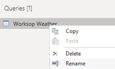
In this case, we will rename ours to be Worksop Weather
Step 4: Apply Data Types
Once the table loads in Power Query:
Navigate to Home → Data Type
- Set time to Date/Time
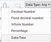
- Set numeric fields (temperature, wind, precipitation, etc.) to Decimal Number
This ensures your visuals behave correctly.
Step 5: Load the Data
Click Close & Apply
Optional: Switch to Table View to confirm everything looks right.
Your weather dataset is now ready for:
- KPI cards
- Line charts
- Slicers
- Forecasting visuals
You now have a live, refreshable weather report powered entirely by a free API.
Build Your First Weather Report Page in Power BI
Now that your weather data is flowing into Power BI, you can turn it into something visual, interactive, and genuinely useful. This is the moment where the raw API data starts to feel real — when you can see the temperature change, spot patterns, and build something you’d check during the day.
Your first report page is where everything comes together: live data, clean visuals, and a few simple choices that make the whole experience feel polished.
Phase 2: Designing the First Report Page
A good weather dashboard does two things well:
- Gives you an immediate answer – What’s the weather like right now?
- Shows how things are changing – What will the next few hours look like?
Your first page can deliver both with a combination of KPI cards, line charts, and a simple slicer.
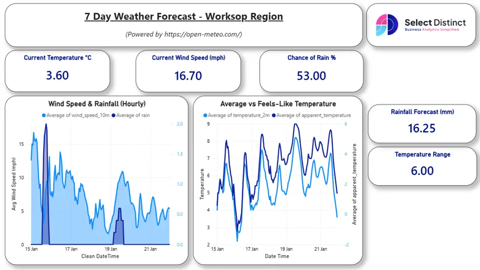
Stage 1: Create KPI Cards for Quick Insights
KPI cards to show ‘what’s happening right now’.
Explicit Measures (recommended for accuracy)
These measures always return the latest reading in your dataset, even as new data arrives.
Current Temperature
Current Temperature =
VAR LatestTime =
    CALCULATE(
        MAX('Worksop Weather'[Clean DateTime])
    )
RETURN
CALCULATE(
    MAX('Worksop Weather'[temperature_2m]),
    'Worksop Weather'[Clean DateTime] = LatestTime
)
Current Wind Speed
Current Wind Speed =
VAR LatestTime =
    CALCULATE(
        MAX('Worksop Weather'[Clean DateTime])
    )
RETURN
    CALCULATE(
        MAX('Worksop Weather'[wind_speed_10m]),
        'Worksop Weather'[Clean DateTime] = LatestTime
    )
Temperature Range (Next 7 Days)
A simple measure to show how much the temperature is expected to vary.
Temperature Range =
VAR LowTemp =
    MIN('Worksop Weather'[temperature_2m])
VAR HighTemp =
    MAX('Worksop Weather'[temperature_2m])
RETURN
HighTemp - LowTemp
Implicit Measures (quick wins)
These don’t require writing DAX – Power BI creates them automatically when you drag a field into a card.
• Chance of Rain → Max of precipitation_probability
• Total Rainfall Forecast (Next 7 Days) → Sum of precipitation
These are great for beginners because they work instantly and still give meaningful insights.
How to Format Your KPI Cards
Once your measures are in place, a bit of formatting goes a long way. A well‑styled KPI card makes the dashboard feel intentional and easy to read.
Here are a few simple tweaks that work well for weather data:
Essential tweaks
- Rename the visual to something clear (e.g., Current Temperature, Chance of Rain).
- Increase the value font size so the number stands out.
- Hide the category label for a cleaner look.
Visual styling
- Background: keep it white or use a light, subtle colour.
- Border: add a thin border or rounded corners to match your theme.
- Shadow: a soft shadow helps the card lift off the page.
Optional enhancements
- Weather icons: add a small sun, cloud, rain, or wind icon using an Image visual.
- Alignment: centre‑align the value for balance.
- Responsive layout: check that the card resizes well if you plan to support mobile.
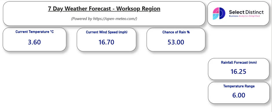
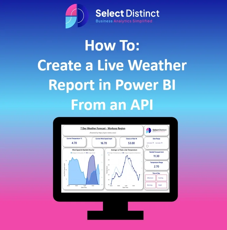
This is an example of how the KPI section comes together.
The goal is clarity: quick insights at the top, with space for trends and visuals below.
Stage 2. Add Hourly Trend Charts
With your KPI cards in place, the next step is to show how conditions change throughout the day. An hourly trend chart helps users spot patterns at a glance.
Wind Speed & Rainfall (Hourly)
An Area Chart works well here because it shows how wind and rainfall rise and fall together over time.
Set up the visual:
- X‑axis: DateTime
- Y‑axis: Average of wind_speed_10m (implicit measure)
- Secondary Y‑axis: Average of rain (implicit measure)
Format the visual:
- Add a clear, descriptive title
- Turn on the legend
- Apply borders or a soft shadow
- Adjust colours to match your report theme
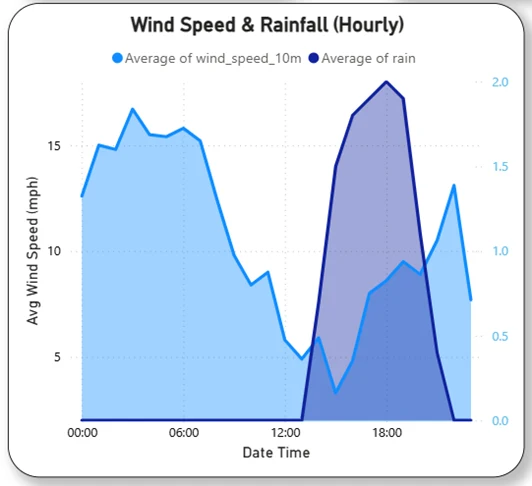
This chart gives users a quick sense of how windy or wet each hour is likely to be, making the dashboard for informative
Temperature vs Feels‑Like Temperature
A Line Chart is perfect for showing how the actual temperature compares to the “feels like” temperature throughout the day.
Set up the visual:
- X-axis: DateTime
- Y-axis: Average of Temperature_2m (implicit measure)
- Secondary Y-axis: Average of Apparent_Temperature (implicit measure)
Format the visual:
- Add a clear, descriptive title
- Turn on the legend
- Apply borders or shadows
- Adjust colours to match your report theme
Tip: Use Format Painter to keep styling consistent with your KPI Cards
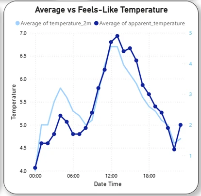
This chart gives users a clear view of how the temperature changes hour by hour, and how it compares to the feels‑like value.
With both visuals added, the dashboard becomes much more informative.
You can now see the current conditions and how they evolve hour by hour.
Stage 3. Add a Time-of-Day Slicer
A simple time‑of‑day slicer helps users explore the weather by morning, afternoon, evening, or night — a small addition that makes the dashboard feel far more interactive.
Create the calculated column:
TimeOfDay =
SWITCH(
    TRUE(),
    HOUR('Worksop Weather'[Clean DateTime]) < 6, "Night",
    HOUR('Worksop Weather'[Clean DateTime]) < 12, "Morning",
    HOUR('Worksop Weather'[Clean DateTime]) < 18, "Afternoon",
    "Evening"
)
Add it as a Slicer:
Use the TimeOfDay column to create a slicer with four buttons:
- Morning
- Afternoon
- Evening
- Night
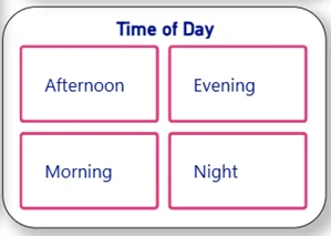
This gives users a quick way to filter the charts and focus on the part of the day that matters most to them.
Add a Date Range Slider
Slicer field: DateTime
Style: Between‑style slider (default)
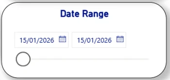
Use: Let users drag across the timeline to focus on a specific day or range
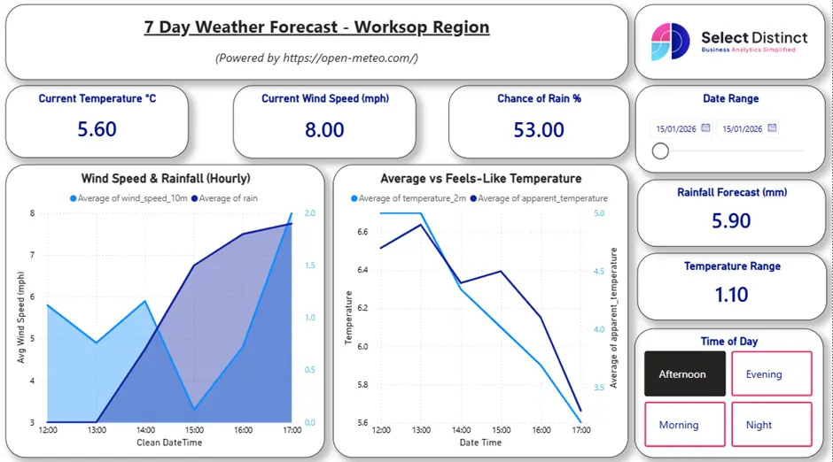
With both slicers added — time of day and date range — the dashboard becomes fully interactive.
Users can now explore hourly trends for any part of the day, across any date, making the report feel personal, flexible, and genuinely useful
Final Thoughts
You’ve now built a clean, interactive weather dashboard powered by live API data — complete with KPI cards, trend charts, and slicers that make the report genuinely usable. These steps form the core of real Power BI work: shaping data, creating meaningful measures, and designing visuals that communicate clearly.
If you want to keep going, try recreating the Temperature, Rain, and Wind pages using the embedded report as your guide. It’s a great way to cement everything you’ve learned.
If you’d like to explore more:
Head over to our Business Analytics Blog for insights, walkthroughs and scenario-driven guides
Or our Power BI Glossary for clear, beginner friendly definitions