
Can we show the Direction of travel on a map in Power BI?
Can it be done with the standard Power BI mapping visuals?
A global commodity trading client of ours had a requirement to create a dashboard that presented the latest locations and headings for a range of container ships
This was part of a migration away from using Tableau, to using Power BI
The internal BI team had been using a dashboard in Tableau which catered for this requirement quite easily, but could not find a way to replicate this in Power BI, so the task was handed over to us
What follows is a simplified guide using some sample data that we have generated to make it straight forward to follow along
We quickly realised that the mapping in Power BI standard visuals could not be used to satisfy the need, so we needed to visit the marketplace
Getting started
The first thing you will need is some sample shipping data
We created a simple spreadsheet with 49 rows to illustrate
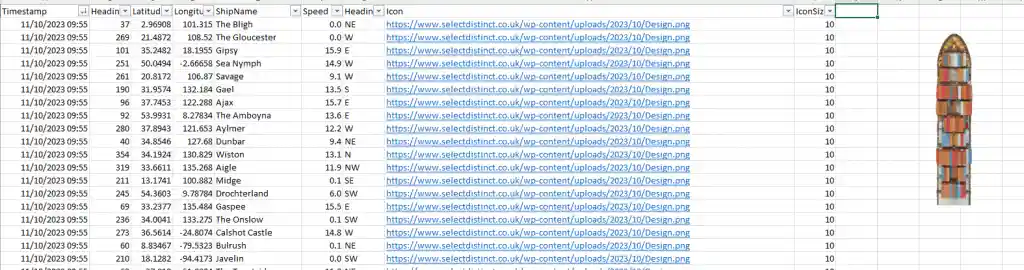
Shipping data is typically polled by the shipping companies and captures the direction of travel (Heading), the latitude and longitude and speed in knots at the time, as well as other static data about the vessel itself
The key data points we will focus on are
Heading – this is the direction the ship is travelling in in degrees, with zero degrees representing north
Latitude and Longitude – The geographical co-ordinates
Ship name – randomly generated ship names
You will also need an appropriate icon to represent the ships
In our case we used a AI image creator to represent a ship and removed the background

It is really important that this image faces North in its neutral position, we will be applying the heading as a rotation to illustrate the direction of travel
Step by Step
The first step is to load the sample data into Power BI
On the Home ribbon in Power BI Desktop, select get data, then Excel workbook and select your excel file
If you download our sample data you will save yourself some time and not have to do anything to the field types
Once it is loaded you can then download the IconMapV3 from the marketplace, which is a free download
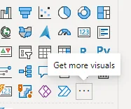
select the three dots and select get more visuals
In the search box type ‘Icon Map’
hit enter and look for Icon Map by James Dales
![]()
![]()
select icon map, then click add and the new visual appears in Power BI desktop
![]()
![]()
![]()
![]()
Now select this and drag it onto your canvas
![]()
![]()
Field settings for the Icon Map
Category – use ship name
longitude = longitude
latitude = latitude
Size = IconSize
Add the icon
Select format your visual
Then go down to objects and expand the section
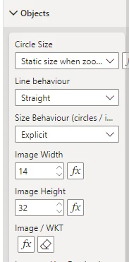
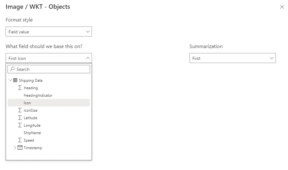
We will use the conditional formatting options under Image / WKT
within there we will use the icon field
The icon field is a url which Power BI uses to download the icon
we have used this

Then set the heading, we use the image rotation to turn the object by the correct number of degrees
![]()
![]()
You will now see the position and direction of travel of these ships on the map
![]()
![]()
Conclusion
Showing the direction of travel on a map in Power BI is made much easier with this add in
This just the basics to get you started, and by following along with the example you can get similar results
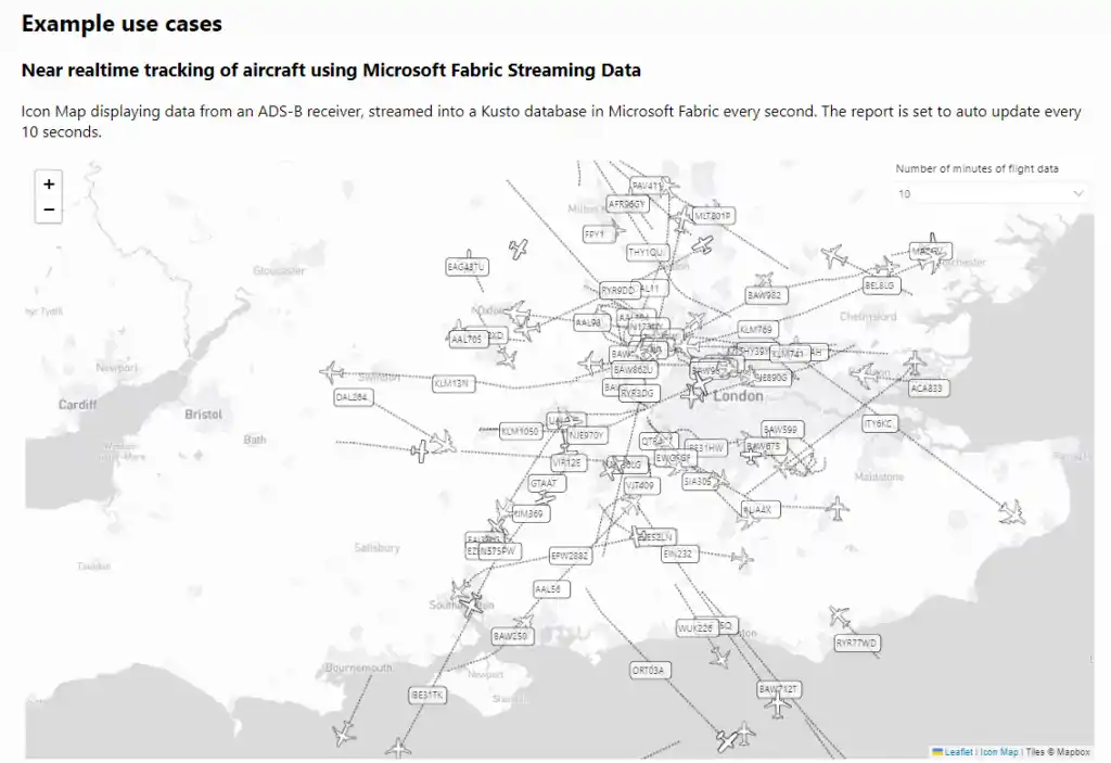
Icon Map v3 is the latest release and has a great deal more features, some of which look very impressive. Take your Power BI mapping to the next level
Further Reading
If you want to take your mapping in Power BI further then take a look at this specialist site
There is a dedicated website to provide further information and support along with some excellent interactive examples
Subscribe to our channel to see more SQL tips and timesavers
Select Distinct YouTube Channel
You maybe interested to read this post
Top Power BI Tips for 2023
Or find other useful SQL, Power BI or other business analytics timesavers in our Blog
Our Business Analytics Timesavers are selected from our day to day analytics consultancy work and are the everyday things we see that really help analysts, SQL developers, BI Developers and many more people. Our blog has something for everyone, from tips for improving your SQL skills to posts about BI tools and techniques. We hope that you find these helpful!