Power BI KPIs – an overview
Power BI KPIs can be a very powerful way to draw attention to specific key performance indicators, but their true value lies in how they drive action. While the technical setup is straightforward, choosing the right metrics to highlight requires a deep understanding of your business goals. This is where professional
Power BI consulting services can assist, helping organizations move beyond basic reporting to create strategic dashboards that align every department with the company’s core objectives.
What is a KPI?
a KPI (
Key Performance Indicator) is a way to measure performance against a target. These targets can be financial, strategic, operational or simply functional. The important point is in the first word ‘KEY’. To be a KPI the thing being measured must be an important part of the success of the organisation
Examples of KPIs
Using a retailer as an example, common KPIs could include some of the following
Sales Gross Sales could be measured against a Budget and progress monitored to ensure that the business remains on track to meet its expected performance
Marketing A Marketing return on investment could be tracked to ensure that marketing spend is delivering sufficient increase in sales revenue (after deducting the marketing cost)
(Sales revenue – Marketing cost) / Marketing cost = ROI Customer Satisfaction Collecting customer feedback and using ordinal measures such as a 1 to 5 scale could be compared against a target or against a year on year comparative
Using KPIs in Power BI
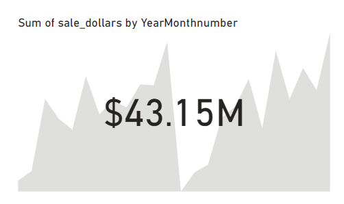
Power BI can be very helpful with its built in KPI visuals, you can easily add the KPI visual to a dashboard to highlight very quickly areas that need to made prominent For example
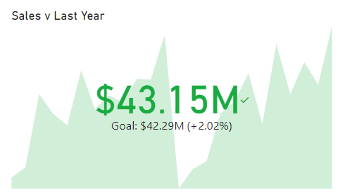
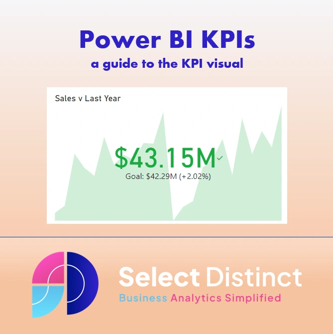
The KPI visual shows a comparison to a target, in this case the sales last year are defined as the target with a value of $42.29M. And we can clearly see that the sales this year are over 2% higher at $43.15M It also shows the trend in the background to give more visual context, as well as a colour scheme which shows the value and the trend in green denoting a good performance
How to create a KPI visual in Power BI
a step by step guide We will start with a sample dataset which we used the Google Public Dataset for IOWA liquor sales, the reason we sue this is because it is a large dataset and is real data If you want to do the same we suggest reading this first
Connect Power BI to Google Big Query – Select Distinct Alternatively just follow along using your own data
Step 1
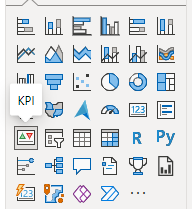
Starting with a Power BI workbook in Power BI desktop, select the KPI visual and drag it onto your canvas
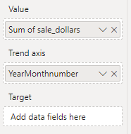
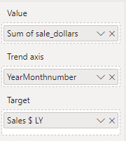
You can see that there are three standard pieces of information that we need in a KPI visual
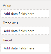
Value is the data to be measured, in our example we use the Sales in Dollars Trend Axis is the time period to be measured across, we will use the date Target is optional, but we will come back to this We can now see the visual begin to take shape
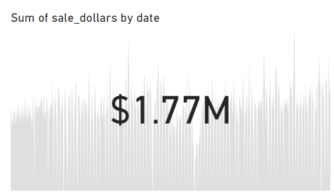
The value shown on the KPI card returns the sum of the sales for the last date in the data set by default. At this stage there are no filters applied, we can also see the trend in the background but it has no colour until we give it context At this point without the target being set Power BI has no way to determine whether this value is good or bad
Step 2
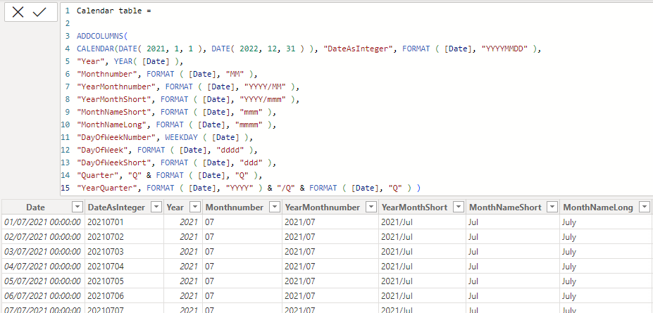
Our data set has two years of data and contains over five million rows of data. But this data does not have any useful date grouping. So we created a data dimension table to return all of the dates relevant to this data set If you want to see how to do this read this blog and grab the DAX code to create your own How to –
Add a date dimension table in Power BI (selectdistinct.co.uk) We now have a calendar table which will give us better options for reporting
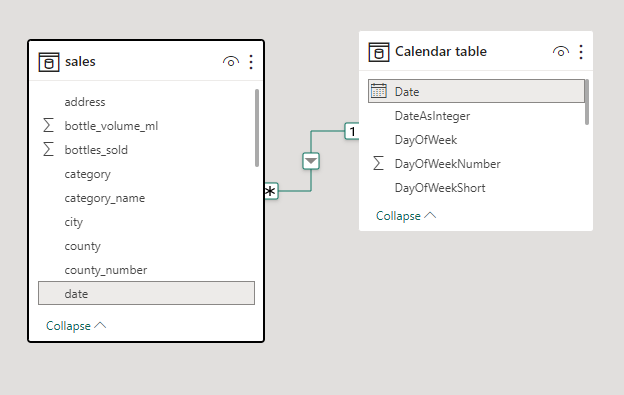
Now set the relationship between the sales data and the calendar table
Now can can amend the KPI to show the monthly trend using the Year and month number field
The trend is now changed to display the monthly data in the background
But you can see that is still lacks the context of a target Usually you would have a sales budget to measure against, but in this case we will use the next best thing, last year as a comparative In the sales table, create a new measure using SAMEPERIODLASTYEAR
Sales $ LY = CALCULATE(SUM(sales[sale_dollars]), SAMEPERIODLASTYEAR('Calendar table'[Date])) For more information on using SAMEPERIODLASTYEAR read this post How to use
SAMEPERIODLASTYEAR in Power BI – (selectdistinct.co.uk)
Step 3
Add the target value to the KPI card, drag the new measure for sales last year into the target field for the KPI visual
With the target value for context, and the value being higher than the target the colour is automatically changed to green giving the KPI visual immediate impact
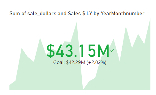
Finally, set the title to something more readable such as Sales v Last Year
Formatting Options for Power BI KPIs
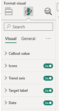 Callout value
 is used to set the font and font size as well as horizontal and vertical alignment options for the main value being measured. You can also change the display units as Thousands, Millions, Billions or even Trillions
Icons allows you turn them on or off. You might notice a small green tick beside the $43.15M sales value which denotes the performance relative to the target, you can also change the size of the icon
Trend Axis allows you to enable the background trend chart behind the main number. There are also options to change the colour using conditional formatting, reverse the logic so that low is good (in the case of overheads for example) and amend the level of transparency
Target Label allows you to turn the target and the target value on or off. As well as change the title from the default ‘goal’ to a word of your choice such as target or last year. You can also amend the font, font size and colour. One other option is to show the distance to goal either on or off, this relates to the +2.02% in our example, with options to show as a percentage, a value difference or both and again to change the direction to decreasing is positive
Date allows you to show the date, in our example it shows the year month number as ‘2022/12’ which could be helpful, again with the usual font, size and colour options
Some Limitations of Power BI KPIs
Although the KPI cards can be very useful, its worth trying to keep the focus on the relative performance of the key indicators, too many visual elements can actually detract from the impact so choose items carefully The axis of the trend line can be misleading at times as it defaults to a maximum and minimum value, this can cause confusion as the low points in the trend tend to look like zero Unlike other visuals there is no interactivity on the objects so no way to drill through, you would need to add other visuals to the page to allow this
Conclusion
The main purposes of KPIs and the KPI visuals in Power BI are to draw your attention to the relevant performance Think of using them to highlight the most important points on a page but keep things to a minimum You can see more about Power BI KPIs on our YouTube channel
Further reading
Choosing relevant and measurable goals and making sure they align with business objectives is a very broad topic. To learn more we recommend you take a look at the Made to Measure KPIs website by Bernie Smith. He shares some really insightful guides to their use and how to avoid common pitfalls
 Made to Measure KPIs | Practical help with KPIs, measures and reporting
 Subscribe to our channel to see more tips and timesavers
Select Distinct YouTube Channel Or find other useful SQL, Power BI or other business analytics timesavers in our Blog Our Business Analytics Timesavers are selected from our day to day analytics consultancy work. They are the everyday things we see that really help analysts, SQL developers, BI Developers and many more people. Our blog has something for everyone, from tips for improving your SQL skills to posts about BI tools and techniques. We hope that you find these helpful!
Business Analytics Blog By
Simon Harrison