Unlock the full potential of your Power BI dashboards with dynamic, visual tooltips.
In this walkthrough, we’ll show you how to create rich, interactive tooltips that enhance user experience and make your reports more intuitive.
Whether you’re looking to simplify complex data or guide users through layered insights, this tutorial—complete with a video demo—will help you build tooltips that are both functional and visually compelling.
Advanced Power BI Tooltips
Power BI by default gives you basic tooltips, which present you with the values included in your visual
These are limited initially to the fields and values that have been used in creating that visual
Watch this quick walkthrough to learn how to create dynamic tooltips in Power BI that improve user experience and data storytelling.
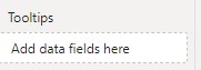
Add other fields into the tooltips
You can easily add other fields by dragging them to the tooltips area in the visualizations panel
(yes I know that’s the US spelling, but thats what it is named in Power BI)
We will show you how to add a rich user experience
Visual Tooltips in Power BI
With a bit of set up you can improve them dramatically and really bring the reports to life
Make your tooltips POP, with custom tooltips pages
Setting up Power BI Tooltips
This video guide walks you through the steps to set up visual tooltips in Power BI
Step 1
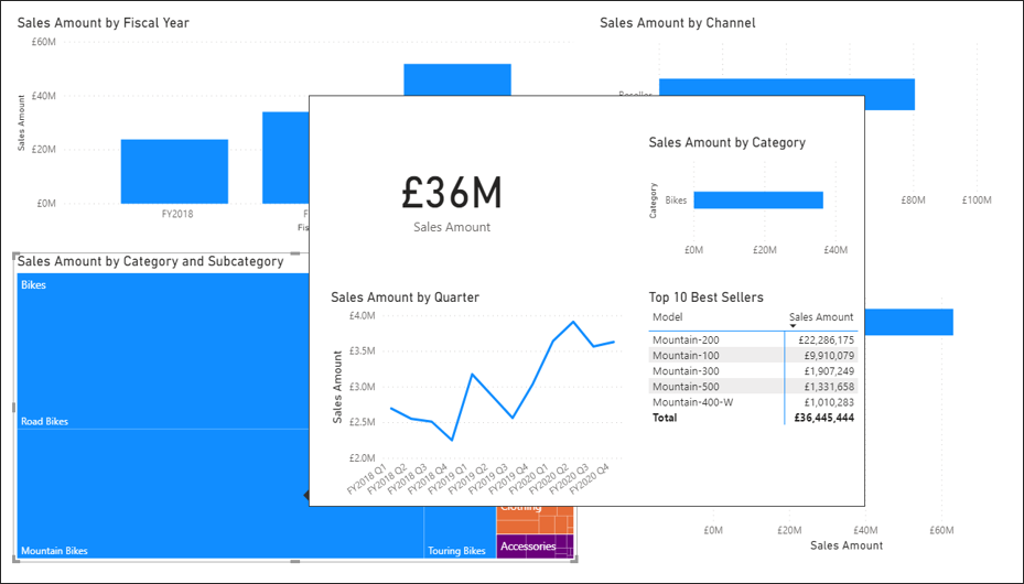
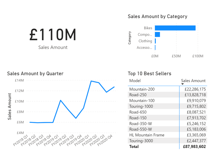
Create a visual tooltip page, which is like a smaller page designed to be used as a pop up visual tooltip
Be creative, but space efficient
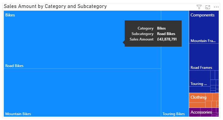
You want the tooltip to show some underlying detail to explain WHY the results are what they are
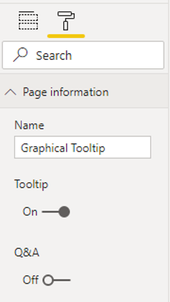
Step 2
Then on to step 2,
where we activate the tooltip.
This involves going into the page information tab and setting it to be a tooltip page
We have called it graphical tooltip, but you might have multiple tooltip pages, so give it a description that explains its content
e.g, Sales Tooltip
Following this, the final step is set up which visuals will use this tooltip
Step 3
Here we go to the tooltip settings for each visual and select the name of the visual tooltip page that we created, and we repeat this for each visual this tooltip is to apply to
Visual tooltips in Power BI bring a rich user experience, giving your users the ability to explore what is behind the data
It brings a real WOW factor and is a very efficient way to present further details
Hope you find this useful
Doing Power BI tool tips well can really make your reports stand out and increase user engagement
Watch the video to see how it is done and how powerful visual tooltips are, your users will love them
Subscribe to our channel to see more Power BI Timesavers
Select Distinct YouTube Channel
Our Business Analytics Timesavers are selected from our day to day analytics consultancy work. They are the everyday things we see that really help analysts, SQL developers, BI Developers and many more people.
Our blog has something for everyone, from tips for improving your SQL skills to posts about BI tools and techniques. We hope that you find these helpful!
This particular tip is also posted in the Power BI Community (or the Fabric Community as it is now being re-branded)
How to use visual tooltips – Microsoft Fabric Community