Building a geographic dashboard is often seen as the “easy” part of a BI project. You have a list of locations, you drag them onto a map, and (in a perfect world) bubbles appear exactly where they should. However, as we discovered during a recent project to map job opportunities across the United Kingdom, the world is rarely perfect.
We quickly learned that without a rigorous normalisation process, a map can easily become a source of misinformation. From inconsistent API outputs to geocoding errors that sent UK jobs to the United States, our journey was a masterclass in the necessity of data precision.
The Starting Point: The “Location Name” Mess
Our journey began with raw API data. On the surface, the data seemed useful, but a quick inspection of the Location Name field revealed a nightmare for any data analyst.

The field was a disorganised mixture of:
- Specific city and town names.
- Postcodes.
- Vague “United Kingdom” tags.
- Inconsistent formatting where one record might list a town and another a county.
The messy raw data before AI classification:
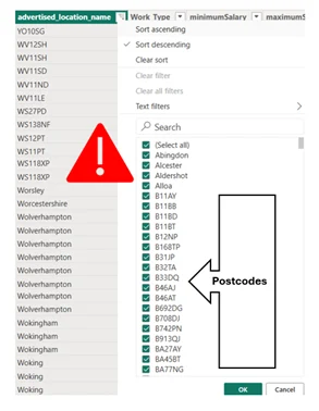
Because these entries were inconsistent with one another, Power BI’s native map visual couldn’t possibly categorise them accurately. We knew that before we could build a dashboard, we had to impose a strict structure on this chaos.
AI-Powered Classification with Vertex AI
To solve the inconsistency, we turned to Vertex AI in BigQuery to automate what would have been weeks of manual lookups. Our goal was to take those messy strings and classify them into three logical tiers: City, County, and Region.
The path to accuracy required experimentation. We initially tried a Zero-Shot approach, but the results lacked the structural consistency we needed. To sharpen the output, we moved to “Few-Shot Prompting,” providing the AI with a small set of curated examples to “teach” it the relationship between UK tiers:
| Input Location Name | City | County | Region |
| Reading | Reading | Berkshire | South East |
| Warrington | Warrington | Cheshire | North West |
| Dudley | Dudley | West Midlands | West Midlands |
| City of London | London | Greater London | London |
Note: We discovered that the model initially struggled with national boundaries; we had to specifically include Edinburgh in our few-shot examples to ensure the AI didn’t ignore Scotland
The “Cleaning After the Cleaning”
Even after the AI processing, the data required further cleaning before it was fit for a dashboard, issues emerged that could have easily skewed our final reporting:
The “Duplicate” Trap
The AI created several duplications of names for the same geographical areas.
For example, the regions of England appeared in the dataset as:
- ‘South East’
- ‘South East (England)’
- ‘South East England’
- ‘North East’
- ‘North East England’
- ‘North West’
- ‘North West England’
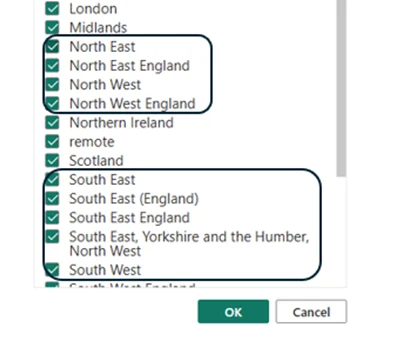

Similarly, we found entries for both ‘Yorkshire and the Humber’ and ‘Yorkshire and the the Humber’ (complete with a typo). If we had proceeded without fixing these, a user filtering by “Region” would see three different options for the same place, splitting the data and rendering the insights useless.
The London Aggregation Problem
Further refinement was needed for the City column. The AI had correctly identified specific London boroughs and areas – such as Barking, Bexley, Brentford, and Chessington – but classified them as individual cities.
From fragmented boroughs to a consolidated ‘London’ view for better aggregation:
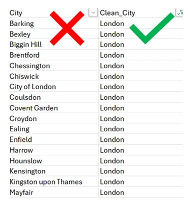
For the purposes of a high-level job distribution map, these needed to be re-classified as ‘London’. Without this step, the map would look cluttered with tiny dots across the capital rather than showing the aggregate strength of the London job market.
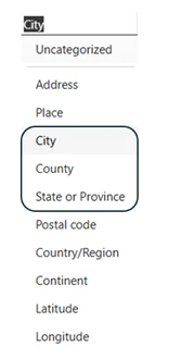
Assigning Geographic Data Categories:
Once we had three clean columns, we encountered a technical hurdle: Power BI viewed this data as simple text strings. It is critical at this stage to manually set the Data Category for each column to provide the visual engine with the metadata it needs to activate geocoding.
For the Region column, we specifically selected State or Province. Because Power BI lacks a native “Region” category, this selection acts as the essential technical bridge, telling the map engine to treat our administrative regions as the primary sub-national boundaries.
The Hierarchy Trap & The Global Identity Crisis
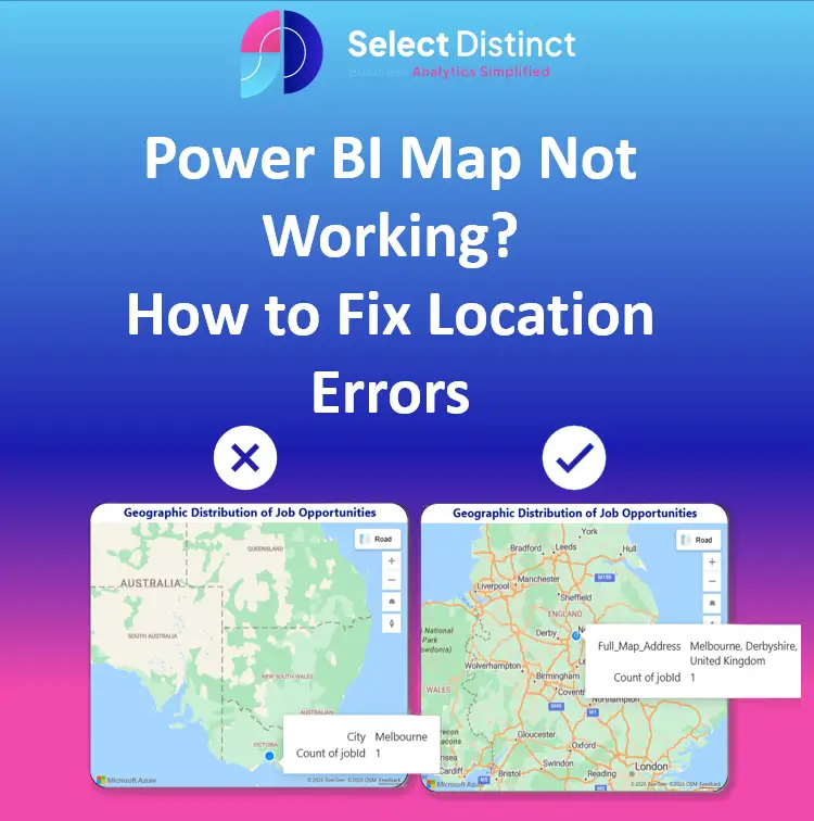
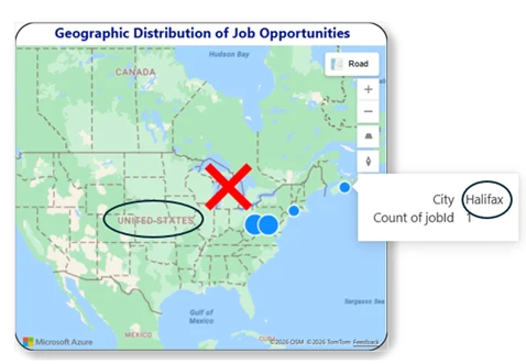
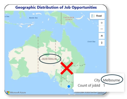
With our categories set, we built a standard Power BI Location Hierarchy (Region > County > City). In theory, this allows users to drill down, but we quickly encountered a major roadblock: the hierarchy failed on the map.
The issue is a loss of context. When a user drills down to a city like “Halifax,” the map visual is stripped of its wider geographic anchors. Without the “parent” data of the County or Country, the geocoder defaults to the most famous or highly populated version of a name globally. This led to the Global Identity Crisis, where job opportunities meant for West Yorkshire or Derbyshire were being “teleported” to Halifax, Nova Scotia and Melbourne, Australia.
Azure Maps didn’t properly work with the hierarchy as we expected it to. However, we chose to keep the hierarchy in the model to use as a hierarchy slicer/filter. This ensures a good user experience for navigation, even though the map itself required a different technical solution to stay “locked” in the UK.
The Fix: Building a “Full Map Address”
To fix this, we realised we couldn’t just tell Power BI the name of the city; we had to give it the full, unambiguous “postal” context.
We created a DAX calculated column called Full_Map_Address to force every data point to stay within UK borders.
The DAX Breakdown
Here is the logic we used to fix the location mismatch:
Full_Map_Address =
VAR City = uk_bi_jobs[clean_city]
VAR County = uk_bi_jobs[clean_county]
VAR Region = uk_bi_jobs[clean_region]
VAR CountryFixed = "United Kingdom"
RETURN
IF(     City IN { "National", "Unknown", "" } || ISBLANK(City),
CountryFixed,     City & ", " & County & ", " & Region & ", " & CountryFixed )
Why This Works
- Handling “Ghost” Data: The IF statement captures records with city names like “National,” “Unknown,” or blanks. Instead of letting the map guess, it pins these entries to the geographic centre of the UK. This ensures every job is counted on the map without causing geocoding errors.
- The “Chain of Context”: For every other record, it strings together the City, County, and Region, and then appends “United Kingdom” at the very end.
The Result: 100% Map Accuracy
| Search Term | Power BI Guess (Without Context) | Result with “Full Map Address” |
| Halifax | Novia Scotia, Canada | West Yorkshire, UK |
| Melbourne | Victoria, Australia | Derbyshire, UK |
Note: “National” and unknown locations are pinned to the UK centre to prevent data loss.
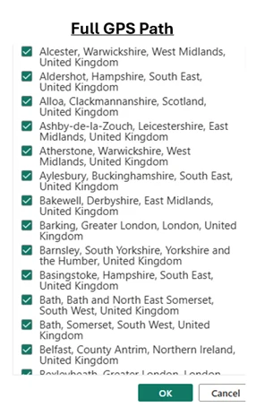
Every record now follows the City, County, Region, UK format.
Conclusion: Lessons Learned
This project reinforced a vital lesson in data engineering: Geography is hard.
Even with sophisticated tools like Vertex AI, the nuances of local geography – like London’s borough structure or international city names – require careful, manual oversight.
By moving away from a failing hierarchy and toward a concatenated Full_Map_Address string, we achieved:
- Total Accuracy: No more UK jobs showing up in the middle of America.
- Cleaner Filtering: No duplicate regions confusing the end-user.
- Scalability: A logic that can be applied to any future API data we ingest.
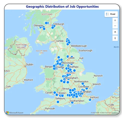
Now, our Power BI dashboard provides a crystal-clear view of the UK job market, allowing stakeholders to make decisions based on where the opportunities are – not where the AI thinks they might be.
If you’re struggling with geographic data in Power BI, remember context is everything. Don’t just give your map a city; give it a home.
If you’d like to explore more:
Head over to our Business Analytics Blog for insights, walkthroughs and scenario-driven guides
Or our Power BI Glossary for clear, beginner friendly definitions