
This short guide to sparklines in Power BI tells you what they are, how they can be very useful and how to add sparklines to your power BI reports
What are Sparklines?
Sparklines are a very compact, space efficient way to show a trend behind a headline number. This tells you whether to investigate further without taking up too much space on the screen
By using sparkline charts you can see at a glance underlying trends, patterns or outliers within the cells of a table or matrix visual
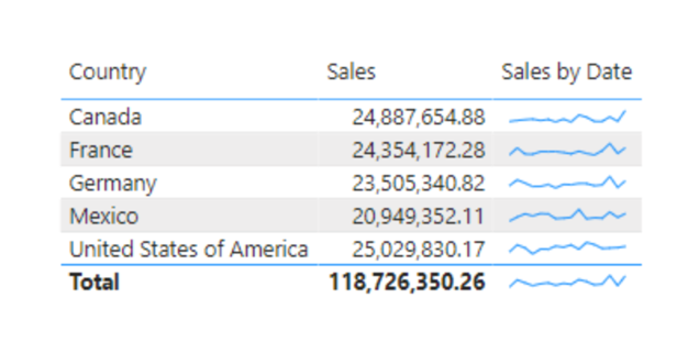
Example of a sparkline in Power BI
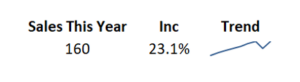
The sparkline helps to give the numbers more context, we can see that the sales in this example are trending upwards. Without the sparkline this may not be so easy to spot without searching through other page or taking up more precious dashboard space with a larger visual
How to Create Effective Sparkline Charts
To create sparklines you must be on a version of the Power BI desktop newer than December 2021
Start off by creating a Table or Matrix visualisation
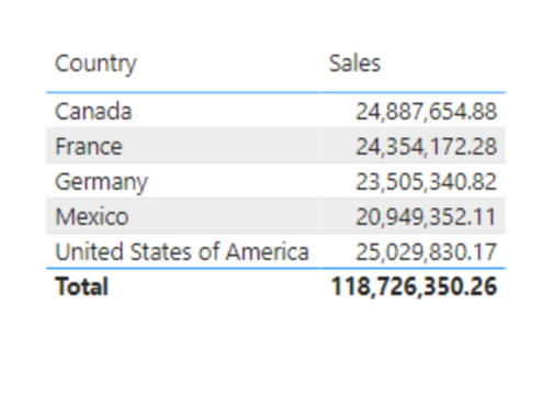
As it is this data does not give much useful context, by adding a sparkline we will be able to clearly see trends
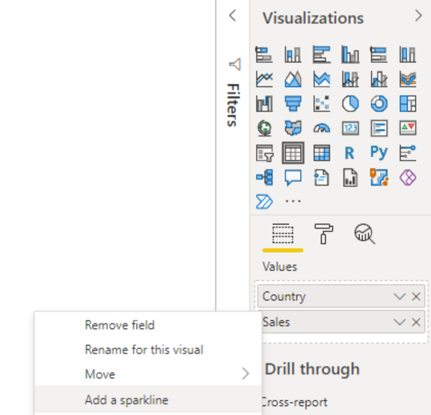
Add a Sparkline in Power BI
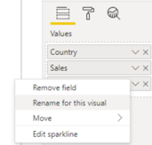
With the Table selected, In the visualizations area, right click a numeric field to use for the sparklines data. In this example ‘Sales’
Then choose add a sparkline
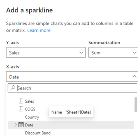
You now need to set the sparkline axis,
In the dialogue box
Choose an appropriate field for the X-axis
This would typically be a date for a time series
Then click create
Our new sparkline will show the sum of the sales values on the Y axis, along the date driven X axis
The new Sparkline is added to the visual
In this example it is automatically named Sales by Date, based on the field names for the Y axis and X axis
You may need to change the name using the standard options for the visual
Advantages and Disadvantages of Sparklines
Advantages of Sparklines
- Sparklines are easy to read and useful for quickly identifying trends and patterns in data
- Sparklines being small can be a very efficient use of space
- Sparklines are typically shown directly next to the data, adding context where its needed
- Sparklines update automatically when the underlying data changes
Disadvantages of Sparklines
- Sparklines have limited functionality compared to regular charts. They cannot display multiple data series, legends, titles, labels
- Sparklines scale their axis to focus on showing the trend but it can be difficult to determine exact values
When to use Sparklines
Sparklines can be added to the table or matrix visuals in Power BI, they are best used when the headline values that these summary views bring need to show more context
They are great when space is limited
You can find sparklines in our Data Visualisation Best Practice guide, along with other hints and tips to help you make the most of your dashboards
Subscribe to our channel to see more Power BI tips and timesavers
Select Distinct YouTube Channel
Or find other useful Power BI timesavers in our Business Analytics Blog