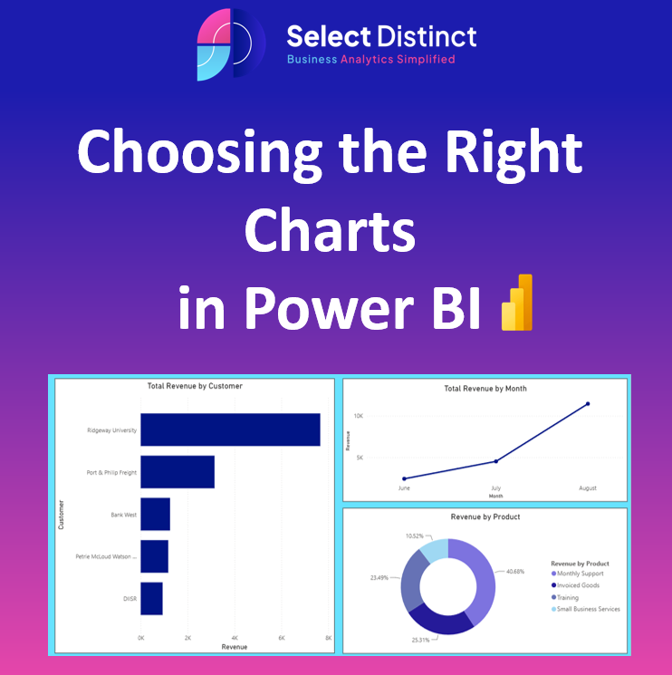
A Beginner-Friendly Guide
Data visualisation is not about making a report look fancy; it is about making information easy to understand. When you choose the right chart, you turn a mess of numbers into clear, useful facts. However, picking the wrong format can hide the truth, confuse your readers, and lead to bad decisions.
Choosing the correct visual is a vital step for everyone from beginners to experienced data analysts. This guide will walk you through the basics of how to show data clearly, whether you are using tools like Power BI or Data Studio.
Why Clear Visuals Matter
Raw data is rarely easy to read. By turning numbers into pictures, you help your audience spot patterns, ups and downs, and big changes quickly. The goal is always the same: tell a simple story that helps people make a choice.
Matching Your Data to the Best Chart
Power BI offers a wide variety of visual tools. The key is to pick the one that fits your goal, not just the one that looks the most colourful.
1. Showing Changes Over Time
When your data covers a specific period, your goal is to show how things have moved
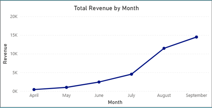
The Line Chart: This is the best choice for tracking trends over time. It connects data points to show a clear path from start to finish.
A Simple Rule: Keep your timeline easy to follow. Don’t crowd too many lines into one chart, as it makes the visual look like a tangled mess that is hard to read.
2. Comparing Different Groups
When you need to compare performance between different items, use a comparison (column) chart.
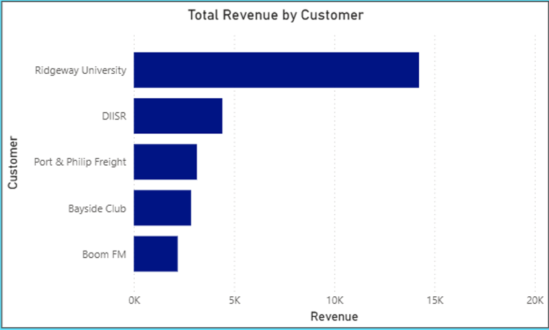
Bar and Column Charts: Using the length of a bar is the easiest way for the human eye to see which value is bigger. Use vertical columns if you have a few items to compare or lay them on their sides (horizontal bars) if you have long category names.
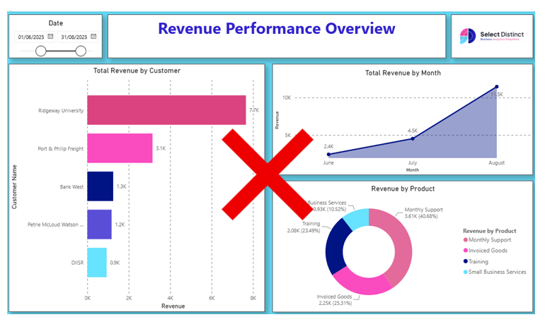
What to Avoid: Stay away from 3D effects. They make it very hard to see which bar is longer and just add “noise” to your report.
3. Showing Parts of a Whole
These charts show how different pieces add up to a total.
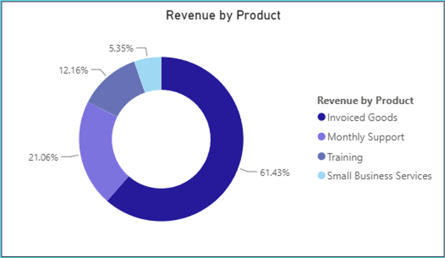
Pie or Donut Charts: These work well for showing a few groups that add up to 100%.
Note: Don’t use these if you have more than four or five slices. If you have too many, the labels get squashed and it becomes difficult to see which slice is the largest. In those cases, a bar chart is almost always easier to read.
4. Looking for Links
If you want to see if one thing affects another, you need to see the relationship between two sets of numbers.
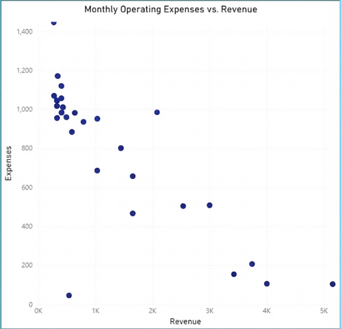
Scatter Plots: These are powerful tools for spotting connections between two numeric variables (like marketing spend versus total sales).
A Word of Caution: Do not force a scatter plot if you are only looking at one variable or comparing categories. Your report will be much more effective if you only use visuals that directly answer a specific business question.
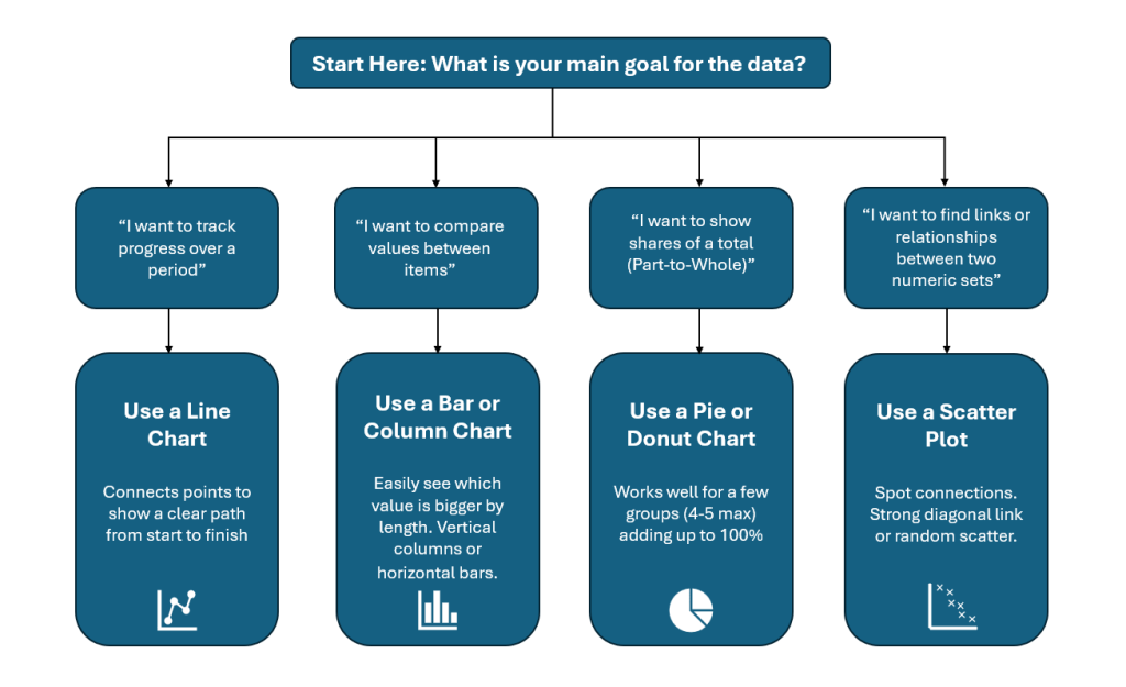
The Chart Selector Flow Chart
Knowing When to Skip a Chart
It is a common mistake to try and force data into every type of chart available in your tool’s library.
For instance, if you don’t have two numeric variables that naturally correlate, don’t force a scatter plot. Your report will be much more effective if you only use visuals that directly answer a business question.
Make Your Charts Interactive
Power BI allows your charts to be more than just static pictures. Use these features to keep your charts clean:
Use Slicers: Instead of creating ten different charts for different categories, create one clear chart and provide a “slicer” (filter). This allows the reader to choose the region or time they care about without cluttering the view.
Tooltips: If a chart feels too crowded, use the tooltip feature to hide extra information. This keeps your main visual clean while still providing detail that only appears when a user hovers their mouse over a specific data point.
Why Your Charts Might be Unreadable
Clutter effectively buries the story you are trying to tell with your data. When a chart is packed with too much information, your audience has to put in extra effort just to figure out the main takeaway. By cutting out unnecessary details, you make it much easier for people to see the point you are making at a glance
Clearing Away the “Clutter”
Good reporting is about removing anything that doesn’t help the reader learn something new.
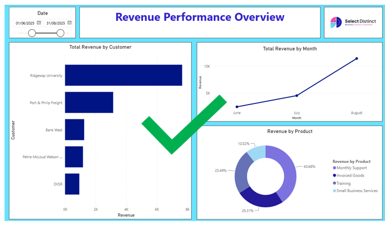
Remove extra lines: If the numbers are clear, you don’t need heavy gridlines behind them.
Keep it clean: Avoid shadows, extra boxes, or decorations that distract from the data.
Use colour carefully: Set specific colours for your data and use them only to point out something important. If every bar or slice is a different bright colour, the reader won’t know where to look.
Quick Checklist for Better Charts
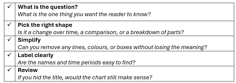
By following these simple steps, you will create charts that people use. The goal is not to show off, but to provide answers in the simplest way possible.
Final Thoughts: Keep it Simple
Keep It Simple
Great reporting isn’t about using the most complex visuals, but about choosing the right charts to make your data speak for itself.
By focusing on the story, cutting out the clutter, and picking the best format for your specific goal, you turn simple numbers into clear answers. Keep refining your work, stay open to feedback, and always prioritize clarity so your audience can find the insights they need at a glance.
Picking the right chart is just the start.
If your team is finding it hard to get clear answers from your reports, we can help you build dashboards that actually make sense and help you make better decisions.
Find out more about how we can help with our Business Intelligence Consulting services.