
In our previous posts, we looked at how to pull your Profit & Loss and Balance Sheet into Power BI to get a clear, high-level view of business health and financial position.
While the Balance Sheet gives you the official ledger figure for Accounts Receivable (AR) showing total money owed to you at a glance, it doesn’t tell you who owes it, how late it is, or what action you need to take.
To turn that static balance sheet figure into an active management tool, you need to bring your Aged Receivables Summary into Power BI.
Step 1: Validate Against Your Balance Sheet
Before building any visuals, the golden rule of financial reporting is data integrity.
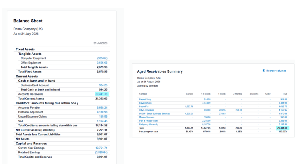
- Pull your Aged Receivables Summary alongside your Balance Sheet.
- Ensure the grand total of your aged receivables matches your Balance Sheet’s Accounts Receivable line down to the penny.
- When your sub-ledger and general ledger tie out perfectly, you know your data model is ready for reporting.
Step 2: Extract Aged Receivables Report from Xero
1.Login to Xero
2.Navigate to Reporting tab

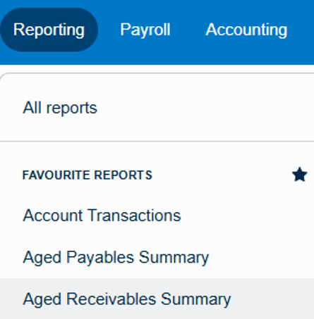
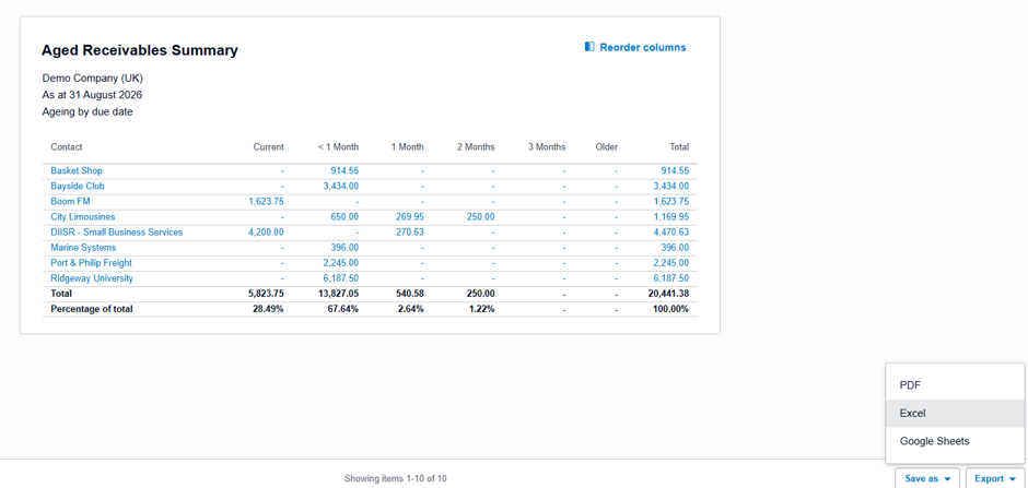
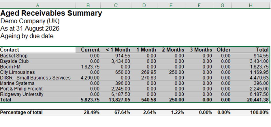
3.Open the Aged Receivables Summary
4.Export it to Excel and save the file to your preferred location
Step 3: Prep and Load the Data
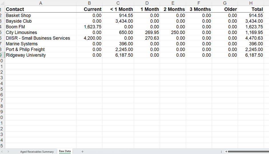
1.Copy and paste the relevant data onto a new tab in your Excel workbook and name it Raw Data
2.Open Power BI – (we are using our existing file from when we created our P&L and Balance Sheet)
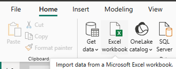
3.Navigate to Home and select Excel Workbook
4.Select the Raw Data sheet and Load
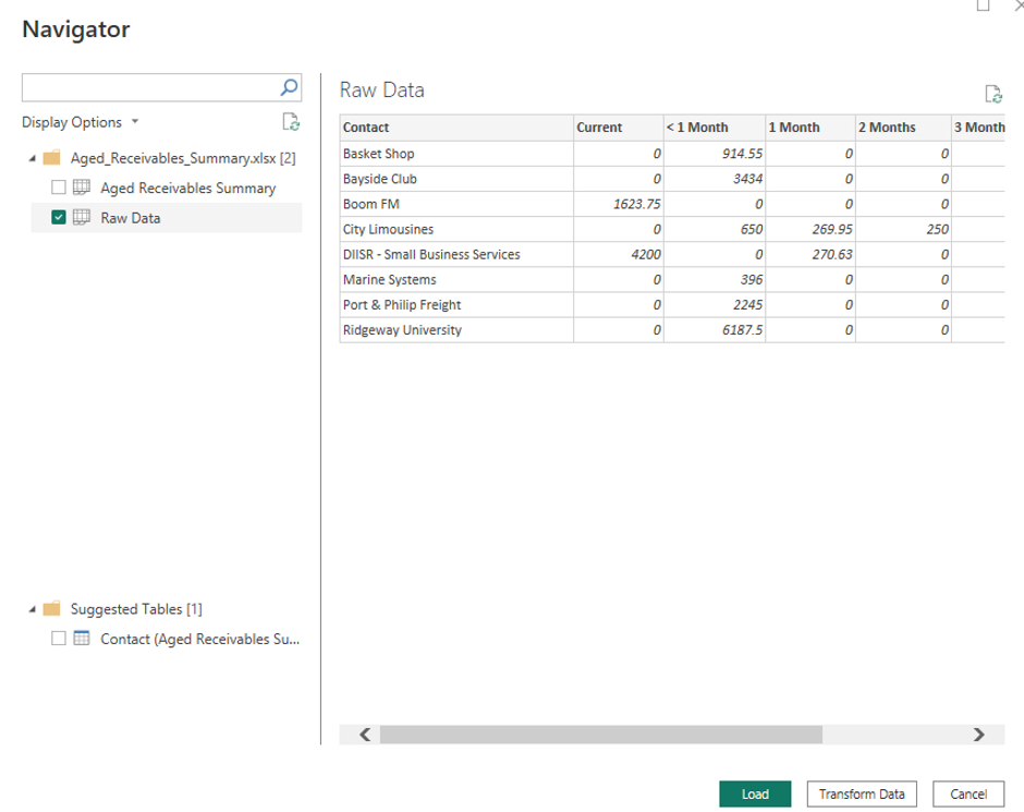
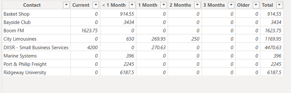
Once loaded into Power BI, the data should look like so
Step 4: Dashboard Design: Creating the KPI Cards

Now that your data is loaded, it’s time to build the dashboard visuals, starting with a top-level summary of key performance indicators (KPIs).
1.Select: New Measure from the ribbon

2.Enter the following DAX code to calculate total outstanding AR:
Total Outstanding AR = SUM(AR_Data[Total])3.Select the Card visual from the visualisations pane and drag your new measure onto it to display the total balance.
4.Format the measure in the data panel using the Measure tools ribbon to adjust currency and decimal places.
5.Repeat these steps to create your remaining KPI measures, such as Total Overdue AR, using a DAX formula that sums your aging columns together like this:
Total Overdue =
SUM(AR_Data[< 1 Month]) +
SUM(AR_Data[1 Month]) +
SUM(AR_Data[2 Months]) +
SUM(AR_Data[3 Months]) +
SUM(AR_Data[Older])

6.Repeat these steps to calculate your Overdue proportion with the following measure:
Overdue % = DIVIDE([Total Overdue], [Total Outstanding AR], 0)Format this to be a Percentage
7. Repeat these steps for your final KPI card to count how many unique clients currently have an active balance:
Total Customers Owing = DISTINCTCOUNT(AR_Data[Contact])Step 5: Adding the Customer Aging Summary Table
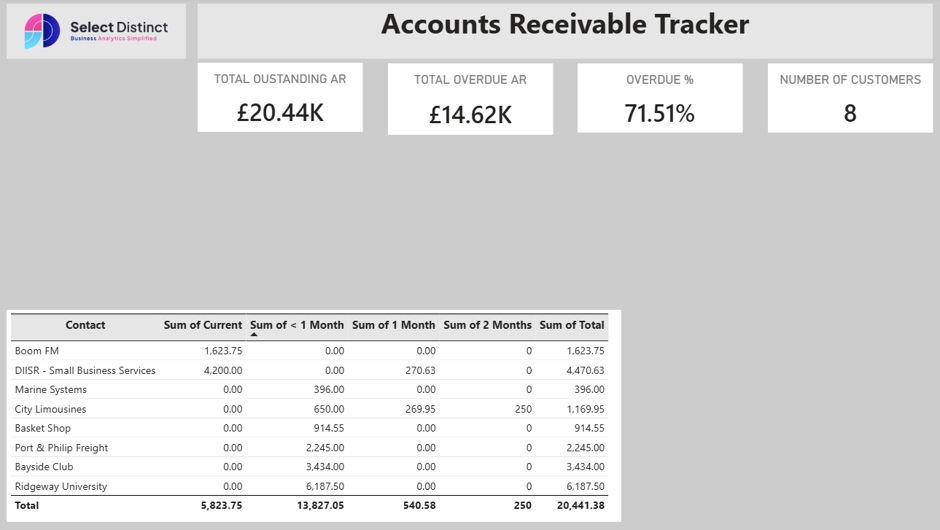
To see how individual balances break down across standard timeframes, add a table visual to display your aging data by contact.
1.Select the Table (or Matrix) visual from the visualisations pane.
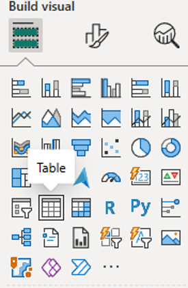
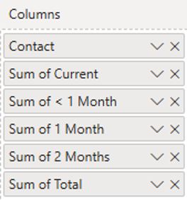
2.Drag the Contact field into the rows/columns section.
3.Add your respective aging columns – such as Current, < 1 Month, 1 Month, 2 Months, and Total into the values fields to give an immediate, row-by-row financial breakdown for each client.
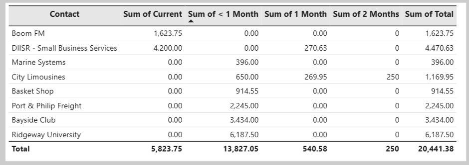
The table should now look similar to above.
Note: We have used format painter from our previous pages in the report to keep the style consistent
We have kept a consistent header style featuring our logo and the Accounts Receivable Tracker title to maintain brand continuity across our report pages:
Step 6: Adding a Contact Slicer for Interactivity
To fill the blank space on the left side of the dashboard and allow users to filter data dynamically, we can add a slicer:
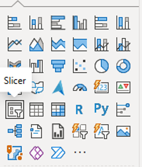
1.Select the Slicer visual from the visualizations pane and place it in the blank space on the left.
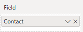
2.Drag the Contact field into the slicer field well.
3.This enables users to select specific clients to instantly filter the KPIs and aging table.
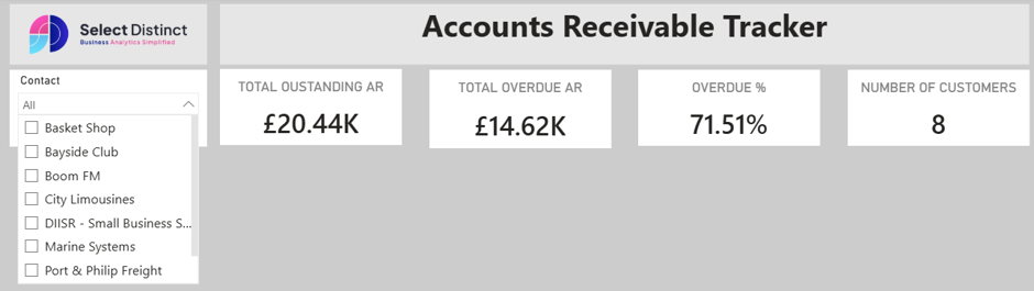
We have used the dropdown slicer to save some canvas space
Step 7: Adding the Status Balance Visual
To visualise the split between current/open balances and overdue amounts, we created a pie chart using two dedicated measures.
1.First, create a measure to calculate the current open balance:
Status_Current = SUM(AR_Data[Current])2.Next, create a measure to aggregate the total overdue amounts:
Status_Overdue =
SUM(AR_Data[< 1 Month]) +
SUM(AR_Data[1 Month]) +
SUM(AR_Data[2 Months]) +
SUM(AR_Data[3 Months]) +
SUM(AR_Data[Older])

3.Select the Pie Chart (or Donut Chart) visual from the visualisations pane.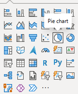
4.Drag both your Status_Current and Status_Overdue measures into the values field to display the proportional split between financial health statuses.
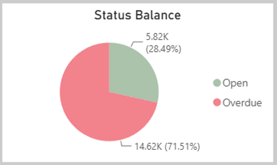
Notice how the colours we have used are Red for Overdue and Green for Open
Step 8: Adding the Open and Overdue by Contact Chart
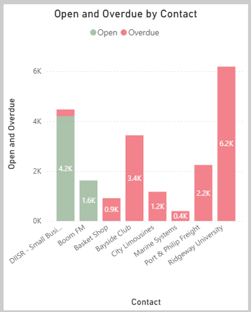
To see which specific customers account for your open balances versus overdue amounts, you can add a stacked column chart using the same measures.
1.Select the Stacked Column Chart visual from the visualisations pane.
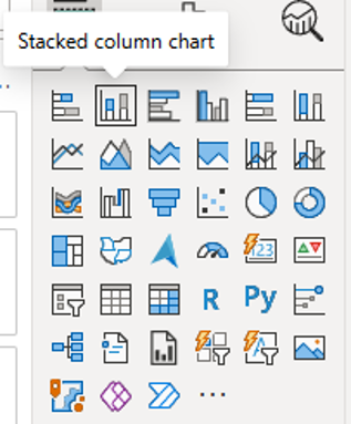
2.Drag the Contact field into the X-axis field.
3.Drag both your Status_Current and Status_Overdue measures into the Y-axis field.
4.Keep the conditional colouring consistent by applying green to open balances and red to overdue balances, making it easy to spot which clients require immediate follow-up.
Step 9: Tracking the Receivables Balance Over Time
To finish the dashboard, we want a trend line showing how our total Accounts Receivable balance has moved over time.
Because we already loaded our general ledger transaction data when building our previous P&L and Balance Sheet reports, we can use an advanced DAX measure to map this out.
1.Create a new measure using the code below to isolate the running balance for Accounts Receivable up to the latest active date:
Month End AR Balance =
CALCULATE(
    MAX('Bal Sheet Transactions'[Running Balance]),
    LASTNONBLANK(
        'Bal Sheet Transactions'[Date],
        CALCULATE(MAX('Bal Sheet Transactions'[Running Balance]))
    ),
    'Bal Sheet Transactions'[Account] = "Accounts Receivable"
)
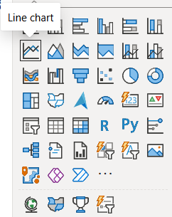
2. Select the Line Chart Visual
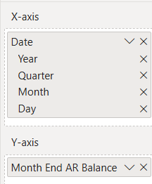
3. Drag the Date field into the X-axis and our new measure Month End AR Balance into the Y-axis
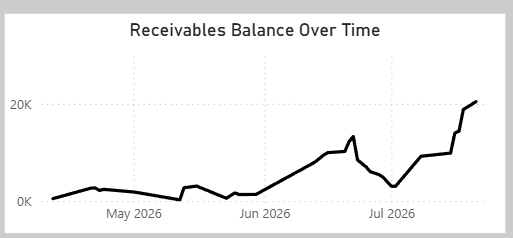
The Line Chart should look similar to above
Completed Dashboard: Overview of Accounts Receivable
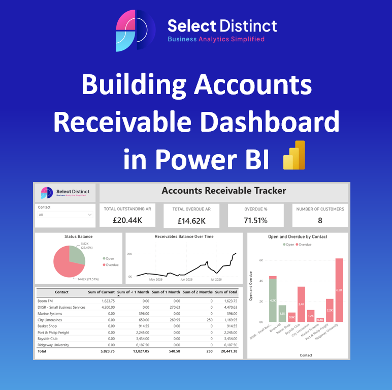
With all these elements in place, our core Accounts Receivable Tracker dashboard is complete, giving us a powerful, interactive macro-level view of our credit control status.
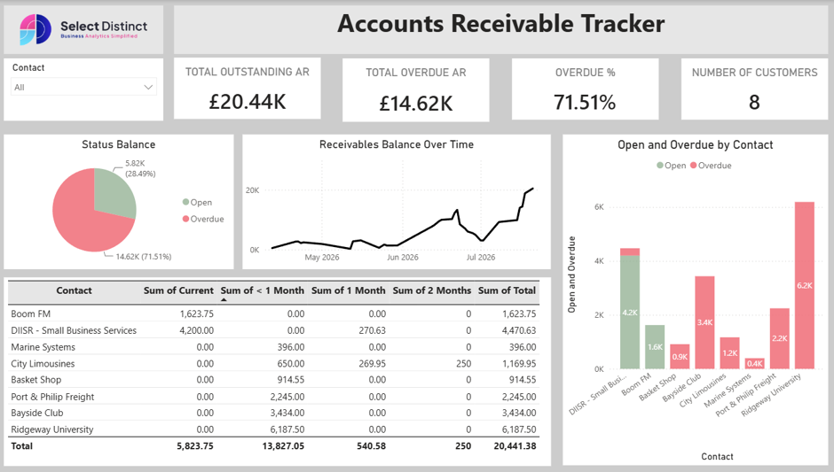
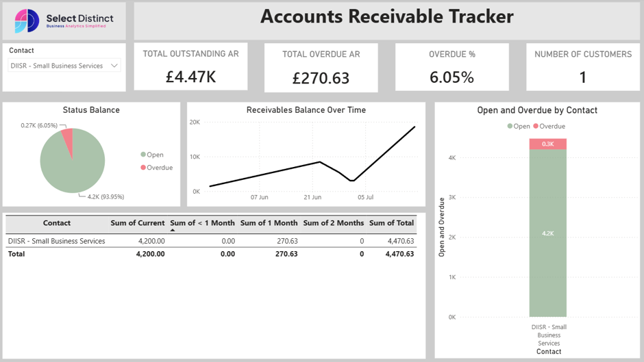
However, to get a truly granular understanding of our cash flow, we also want to provide an add-on view in our report.
In the next section, we’ll look at how we built the Customer Transaction Breakdown add-on to examine specific invoice movements line by line.
Additional Page: Customer Transaction Breakdown
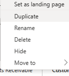
Step 1: Duplicate Your Dashboard Page: Right-click your completed Accounts Receivable dashboard tab in Power BI, duplicate the page, and rename the new tab to Customer Breakdown.
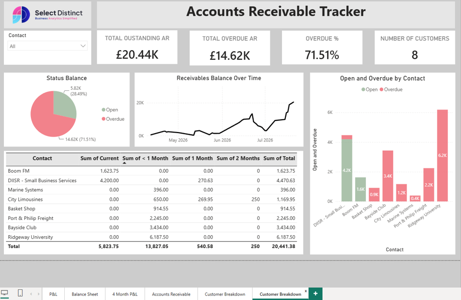
Step 2: Clean Up the Canvas: Delete the extra charts and visuals you no longer need on this specific page, leaving a clean, mostly blank canvas.
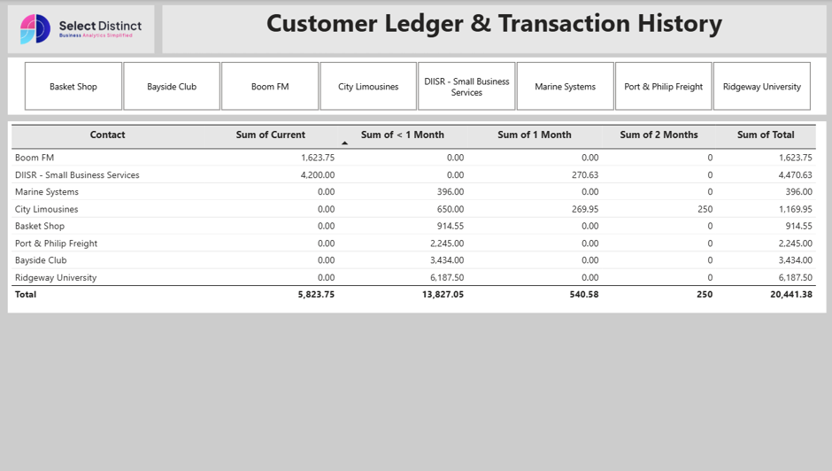
Step 3: Update the Header: Rename the main title text box at the top to read Customer Ledger & Transaction History.
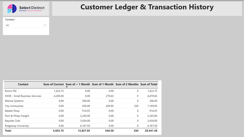
Step 4: Configure the Customer Slicer: Because you only have a handful of customers, select your Contact slicer, go to the formatting options, and change the Slicer Settings style to Tile.
Step 5: Position and Stretch the Table: Move your Customer Aging summary table to the top directly underneath the tile slicer, and stretch it out horizontally across the canvas for a clean, streamlined layout.
What’s Next on Your Power BI Journey?
Building an automated Accounts Receivable dashboard is one of the most effective ways to take control of your cash flow and streamline credit control. By connecting your Xero data straight into Power BI, you replace static spreadsheets with a dynamic, single source of truth.
We want to hear from you: Which finance dashboard should we build and break down next? Whether it’s Cash Flow Forecasting, Accounts Payable, or Budget vs. Actuals, drop your suggestions using our submission form below!
Ready to Transform Your Financial Reporting?
Stop spending hours managing manual spreadsheets and monthly reports.
- Want this exact setup built for your business? Use our submission form to get in touch with Select Distinct today and see how we can automate your financial dashboards.