

If you have ever exported data straight from your accounting software into a BI tool, you know it rarely looks boardroom-ready on the first try.
Getting from messy ledger entries to a sleek, executive-level Profit & Loss (P&L) usually comes down to three core tools:
- Xero: Your source of truth for all transactions, tracking categories, and account codes.
- Excel: The bridge you use to structure, filter, and map out your chart of accounts.
- Power BI: The tool that brings it all together with dynamic measures, clean hierarchies, and a polished look.
Stage 1: Xero Data Extraction
Before building anything, you need to pull your raw data.
Start by locating your standard Profit & Loss report directly within Xero so you have a live reference point to cross-check your numbers against.
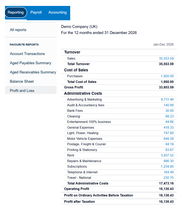
From there, you’ll need to export two core components:
- The Chart of Accounts: Your master list of account codes and categories.
- The Transaction Data: Every individual financial line item that feeds those accounts.
Chart of Accounts
1. Navigate to the Accounting tab on the Xero navigation bar.

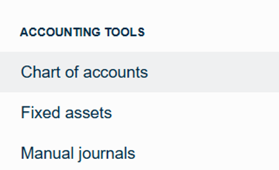
2. Select the tab to open the dropdown menu and locate Chart of Accounts under the ACCOUNTING TOOLS section.
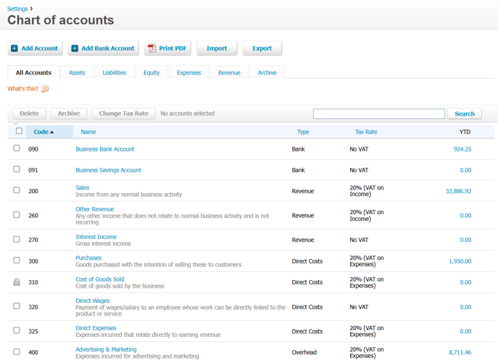
3. Export this file, download it, and save it as an Excel Workbook
Transaction Data
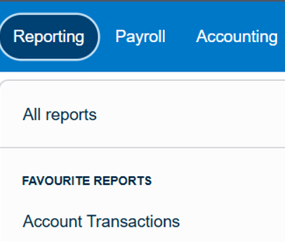
1. Navigate to the Reporting tab on the Xero navigation bar.

2. Locate Account Transactions under the FAVOURITE REPORTS section.
(Note: If you cannot locate it from the dropdown, select All reports to find it there).
3.Select all accounts (this makes it much easier to filter in Excel)
4. Select these 13 core columns (feel free to select additional options if your reporting requires extra details)
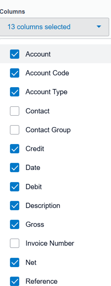
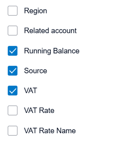
5. Export, download, and save this file as an Excel Workbook
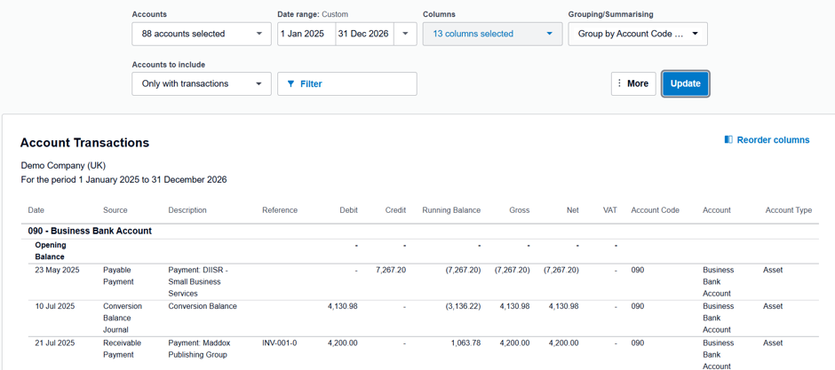
Pro Tip: Make sure both of these files are saved explicitly as Excel workbooks (.xlsx) rather than defaulting to CSV format to preserve your data types
Stage 2: Excel – Data Preparation
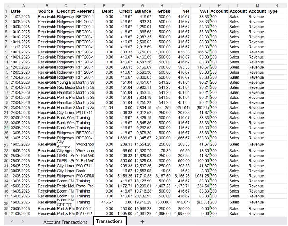
1. Open your Transaction Data file and delete the top 4 rows of report metadata so your table headers sit neatly on row 1
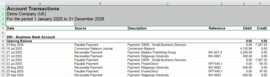
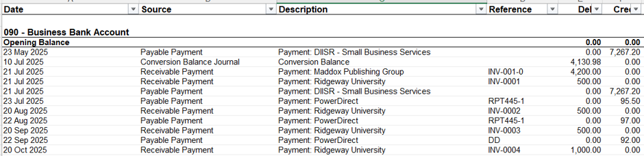
2. Select all columns, go to the Data tab, and click Filter so filter arrows appear on your top row
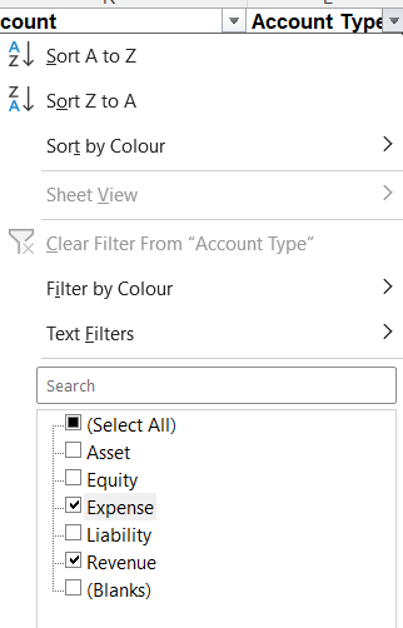
3.Navigate to the final column (Account Type) and filter it to show only Revenue and Expense (since we only want P&L-related figures)
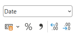
4. Ensure the Date column is correctly formatted as a Date
5. Copy and paste this newly filtered data onto a separate, clean tab
6. Save and close the file
Stage 3: Power BI Ready Data
1. Open Power BI Desktop
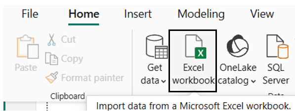
2. Click Excel Workbook on the Home ribbon and select your cleaned Transaction Data file
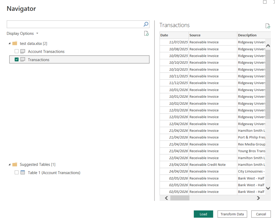
3. Ensure the correct tab containing your P&L figures is selected, then click Load
4. Repeat these steps to load in your Chart of Accounts data
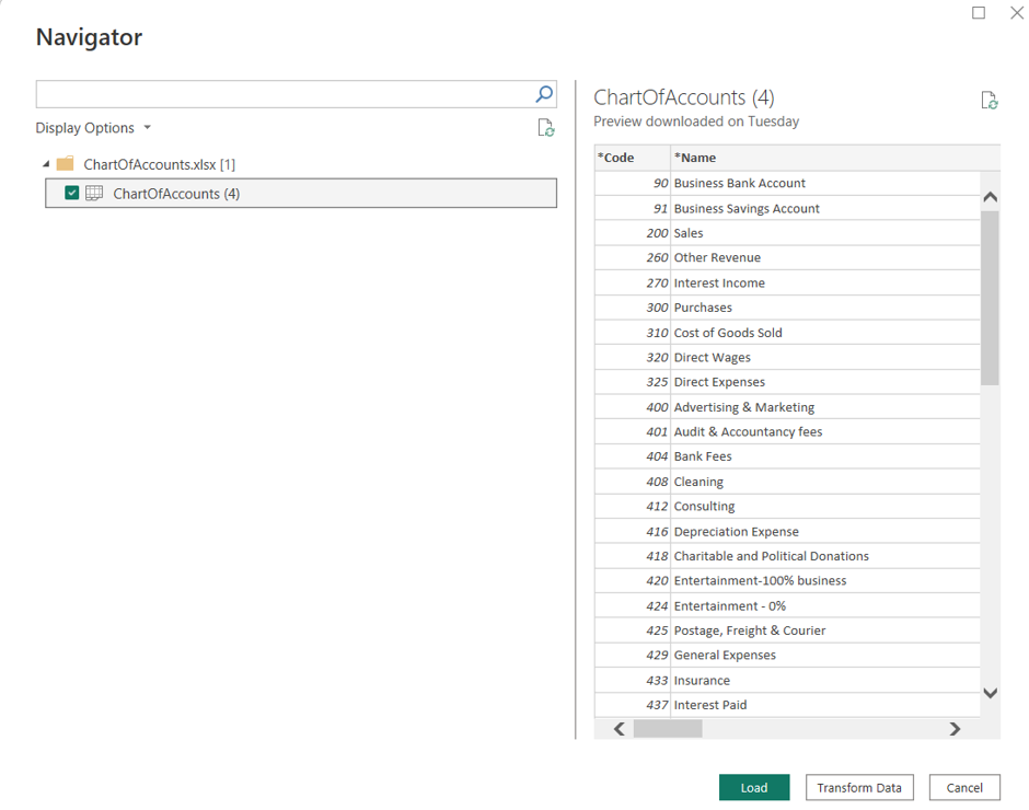
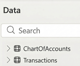
You should now have two tables loaded into Power BI. Next, we will bring in our mapping structures:
Creating Mapping Tables
1. Navigate to Home  Enter Data
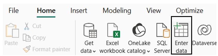
2. Create your mapping tables:
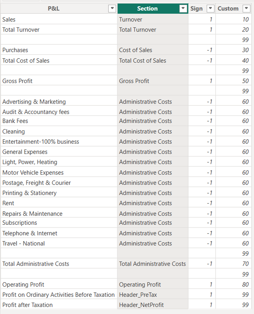
Table 1 (P&L Section Mapping): Enter your section names. This is vital for sorting the custom order of your P&L layout
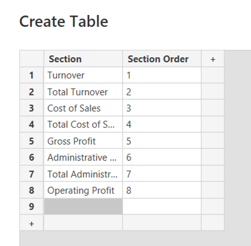
Table 2 (P&L Structure): Copy and paste the structural data template
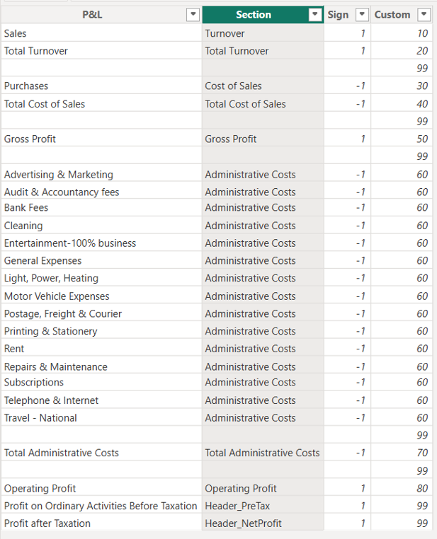
You should now have four total tables loaded into your Power BI model
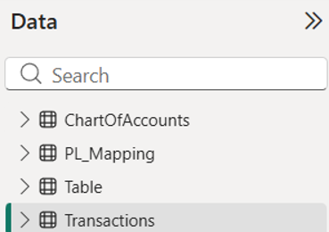
Determining Relationships
Next, we need to connect our data model:
Build a 1-to-Many relationship between your tables:
- ChartOfAccounts [Code]
 Transactions [Account Code]
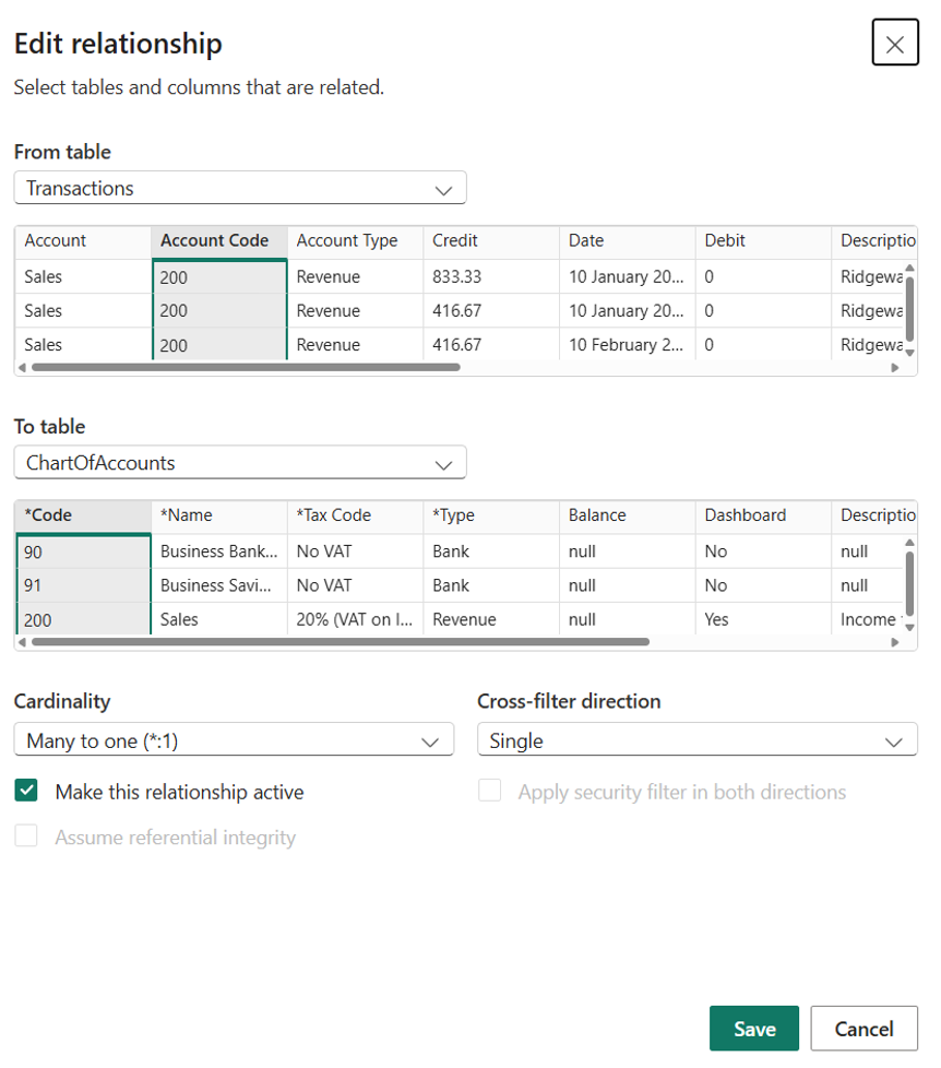
Troubleshooting Tip: If the relationship fails to validate at first, you may need to filter out any null values using the date column (in Power Query), then click Close & Apply
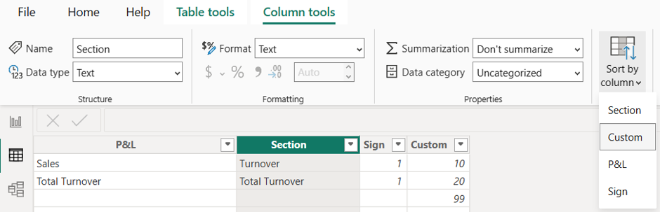
Sort the P&L Mapping Table
Navigate to your mapping table and sort the section column by your Custom sort order column to ensure your P&L flows logically from Revenue down to Net Profit
Creating the Dynamic P&L Measure
To handle standard accounts alongside calculated subtotals cleanly, create a new measure using the following DAX formula:
Code snippet:
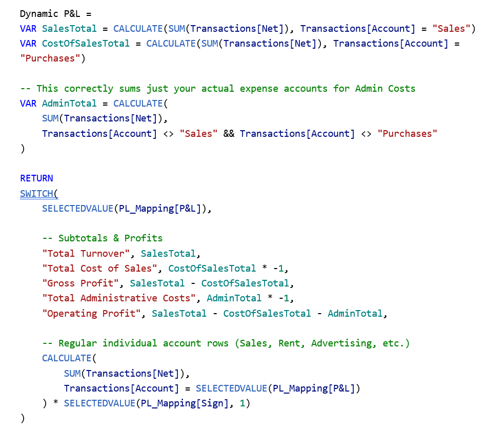
This ensures that your matrix visual iterates through a true, corporate-style Profit and Loss statement layout.
Building the Matrix Visual
1. Select the Matrix visual from your visualization pane.
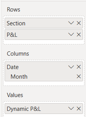
2. Drag and drop your fields into position:
- Rows: From the P&L Mapping Table Section then P&L
- Columns: From Transactions Table Date (Tip: Switch this from the default day-by-day hierarchy to Year or Month/Year to prevent horizontal overflow)
- Values: From Transactions Table Dynamic P&L (the measure we just created)
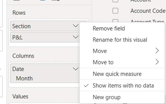
If any rows appear blank, make sure to right-click your row field and toggle Show items with no data against your Section.
You should now see the skeleton of your Profit & Loss!
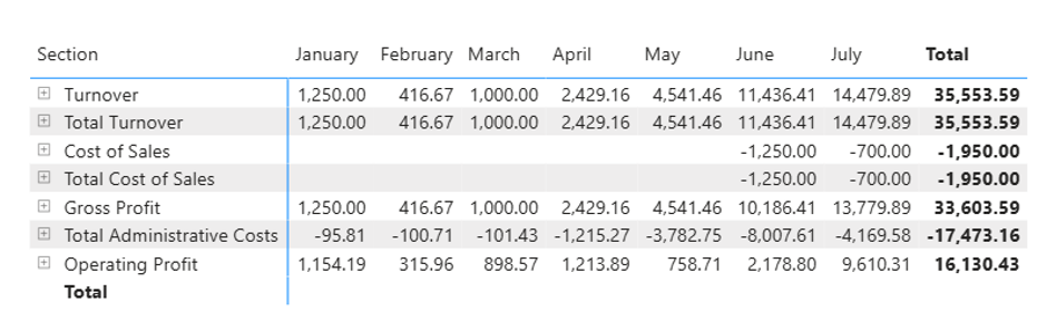
Finally, expand out the toggle arrows (+/-) to review your figures on a line-by-line basis.
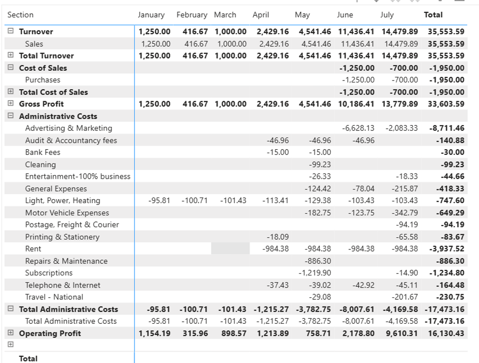
Now we have a well-structured Profit & Loss
Formatting Your P&L for a Clean & Professional Finish
Once your calculations are in place, the final step is transforming a standard Power BI matrix into a clean, executive-ready financial statement.
Here is how to style your visual to get that polished, professional look:
1. Matrix & Grid Styling
- Column Headers: Set to Bold, Centre Alignment, and a Light Grey background colour
- Values: Set background colours to White to ensure a clean layout against the grid.
- Horizontal Gridlines: Turn On (Light Grey, 1px) to make multi-column tracking easy on the eyes.
- Vertical Gridlines: Turn Off
- Row Spacing & Padding:
- Turn on Blank Rows so your sections are cleanly spaced out.
- Turn row padding off to keep your totals and headers tight against the line items without excessive vertical gaps.
2. Cleaning Up the Hierarchy
- +/- Icons: Turn off the expand/collapse icons in the formatting pane for a sleek, static corporate report view.
- Row Subtotals: Turn off unnecessary row subtotals to prevent clutter.
- The “Section” Header Trick: Add a clean company logo or branding element in the top-left corner of your report layout, positioned so it neatly covers up the default “Section” field header text for a custom dashboard feel.
3. General Visual Polish
- Title: Turn On and name your report clearly (e.g., Xero Demo Company Profit & Loss (£)).
- Grid Borders: Set border colour to Black for a sharp container outline.
- Canvas Background: Soften the overall report page by adjusting the canvas background to a slightly deeper grey so your white matrix visual “pops” off the screen.
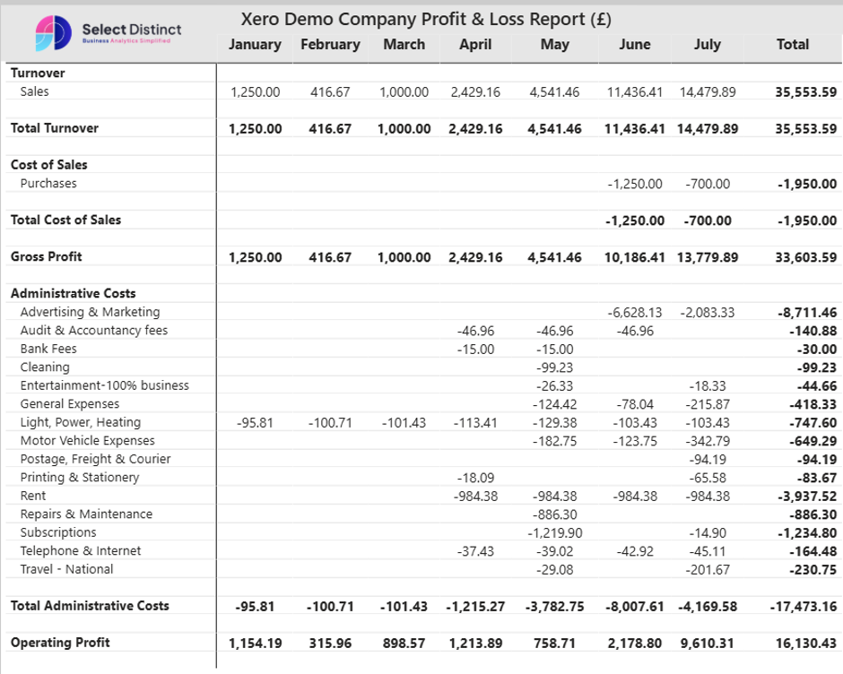
The Matrix should now be structured like so, giving it a Profit & Loss feel.
Conditional Formatting Your P&L Totals
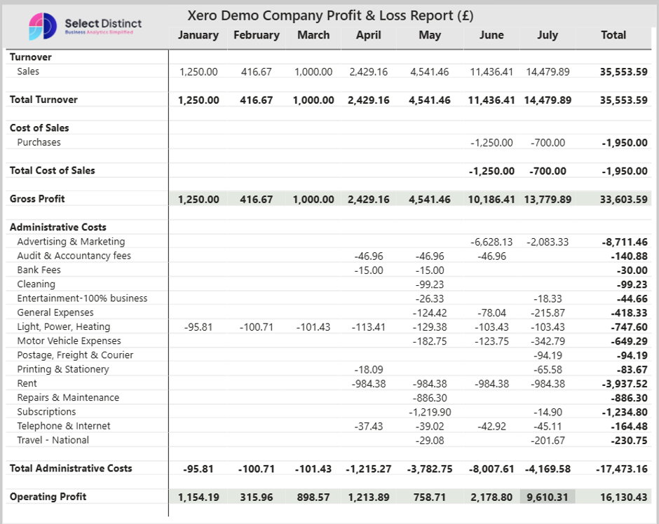
To make your key profit rows stand out and give your statement that executive-level polish, you can use conditional formatting to highlight Gross Profit and Operating Profit with a soft, professional sage green.
Here is how to set it up in Power BI:
1. Select your Matrix visual and head over to the Format pane (the paintbrush icon).
2. Look for Cell elements and choose the series for your Dynamic P&L measure.
3. Find Background colour and click the fx button next to it to open the conditional formatting window.
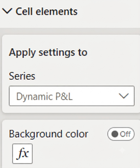
4. Set up your rules using these exact parameters:
- Format style: Rules
- Apply to: Values and totals
- What field should we base this on: P&L
5. Add your conditional rules for the key totals:
- If value is Gross Profit set color to #E3E8E1
- If value is Operating Profit set colour to #E3E8E1
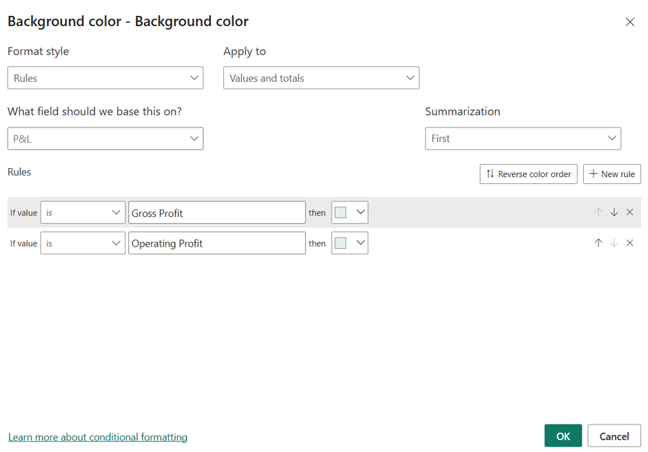
6. Click OK to apply.
Tip: Make sure your conditional formatting toggle is switched on in the formatting pane card so the rules actively render on your visual matrix!
Once all your formatting and conditional rules are applied, your final P&L matrix should look like this:
Adding Executive Summary Cards & Trends
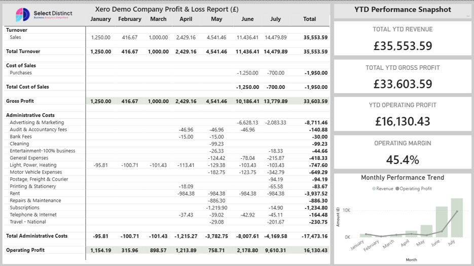
To complete your dashboard and make use of the remaining canvas space, you can add a YTD Performance Snapshot sidebar alongside your P&L matrix.
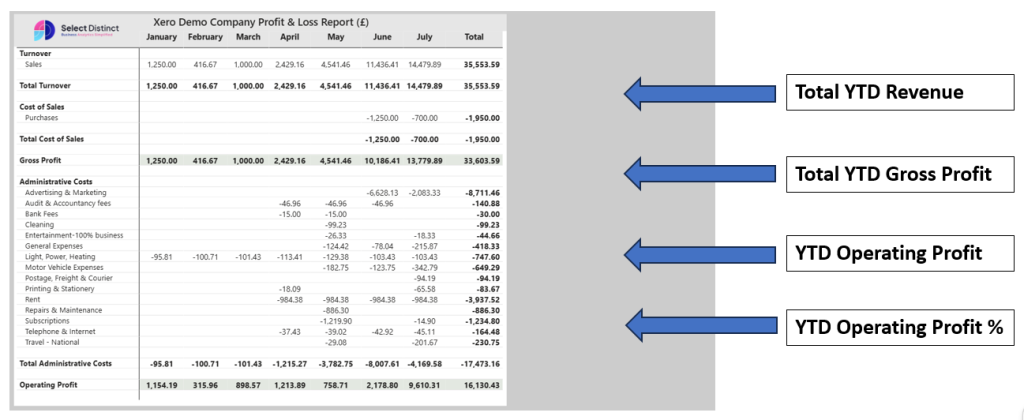
Using key summary cards and a quick performance trend chart gives stakeholders a high-level overview at a glance before they dive into the line-by-line financial statement.
What to Include in the Sidebar:
- Total YTD Revenue Card: Highlights the top-line performance.
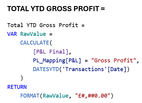
- Total YTD Gross Profit Card: Displays core profitability after direct costs.
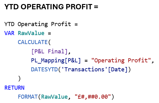
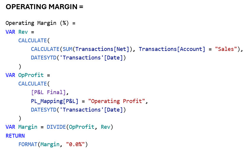
- YTD Operating Profit Cards (Value & Percentage): Shows final operating margins and cash efficiency.
- Monthly Performance Trend Visual: A combined column and line chart mapping revenue against operating profit month-over-month.
You can build these KPI cards and trend visuals using the following core DAX measures:
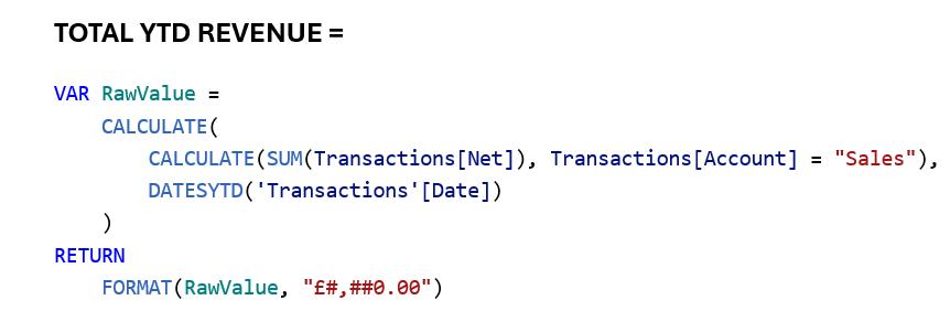




Bringing It All Together: The Final Dashboard
To round off your dashboard and make the most of your canvas layout, add the Monthly Performance Trend visual beneath your KPI cards.
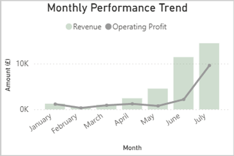
This combined column and line chart maps your monthly revenue against operating profit side-by-side, giving stakeholders an immediate view of financial momentum over time.
Once your YTD snapshot cards, trend chart, and polished P&L matrix are all locked into place, your finished Power BI report is ready for the boardroom:
And there you have it a clean, executive-ready Profit & Loss statement and performance dashboard built straight from your raw Xero data.
By combining proper table mapping, dynamic DAX measures, and thoughtful Power BI formatting, you have turned messy ledger entries into an automated financial reporting powerhouse.