
Our Work: Internal Projects & Proof of Concepts
At Select Distinct, we don’t just build for clients; we constantly innovate internally to push the boundaries of what is possible with data. This collection of internal projects demonstrates our expertise in API integration, financial modeling, and complex market analysis.
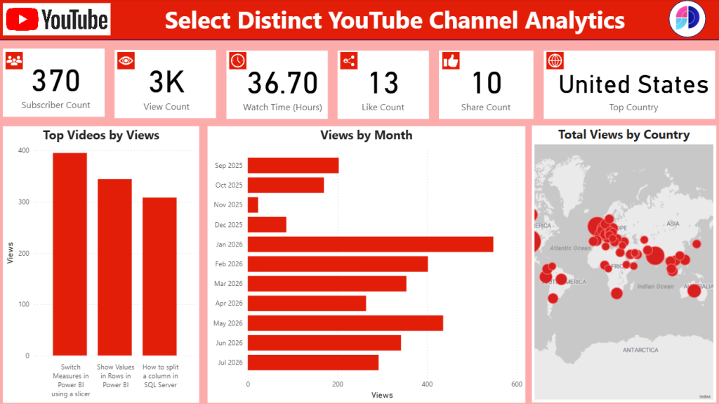
YouTube Channel & Content Analytics Suite
The Challenge: Consolidating fragmented video data to track overall channel growth, audience geography, and content performance in one centralised view.
The Solution: An executive-ready analytics dashboard designed to transform raw metrics into clear, actionable viewing trends.
Key Highlights:
Performance Scorecards: Instant visibility into subscriber growth, total views, watch time, and engagement counts.
Content Insights: Clear ranking of top-performing videos to quickly identify what topics resonate most with viewers.
Audience & Geographic Reach: Detailed monthly trends and global mapping to understand when and where your audience is engaging.
Xero Financial Reporting Suite
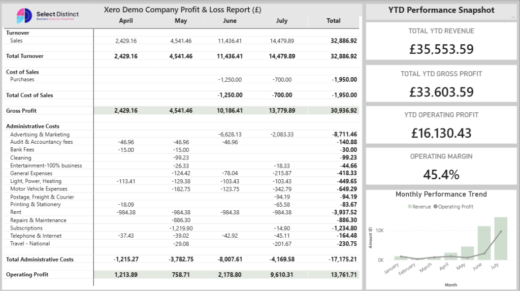
The Challenge: Transitioning from high-level financial summaries to a comprehensive, line-by-line statement that gives stakeholders complete visibility into operating costs, turnover, and asset health.
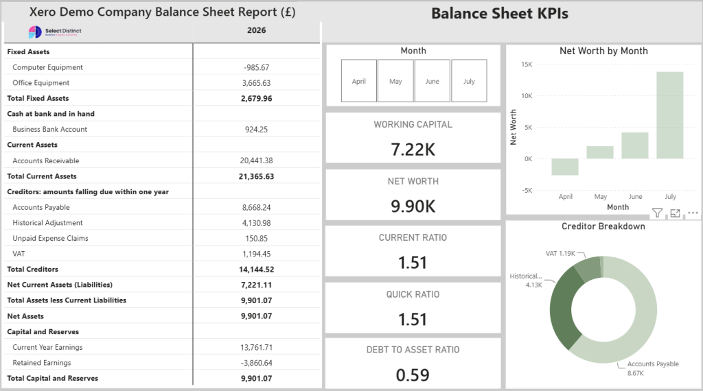
The Solution: A detailed financial dashboard structured to mirror standard accounting practices, combining profit and loss tracking with real-time balance sheet KPIs, working capital insights, and trend analysis.
Key Highlights:
Detailed P&L Matrix: A clean monthly view tracking Turnover, Cost of Sales, Gross Profit, and individual Administrative Expenses from January through July.
Balance Sheet & Position KPIs: Executive cards and breakdown charts providing real-time visibility into Fixed Assets, Working Capital, Net Worth, Current/Quick Ratios, and Debt-to-Asset ratios.
YTD Performance Snapshot: High-level metrics tracking Total YTD Revenue, Gross Profit, Operating Profit, and Operating Margin.
Monthly Performance Trend: A combined revenue bar chart and operating profit trend line to easily evaluate financial momentum month-over-month.
Financial Performance Analytics
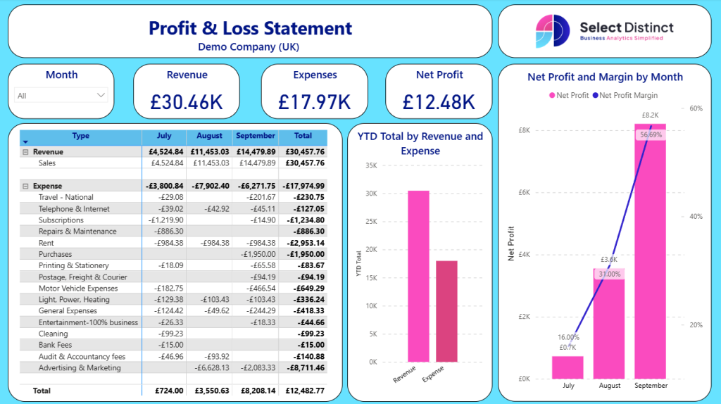
The Challenge: Moving beyond static spreadsheets to understand the “why” behind the numbers.
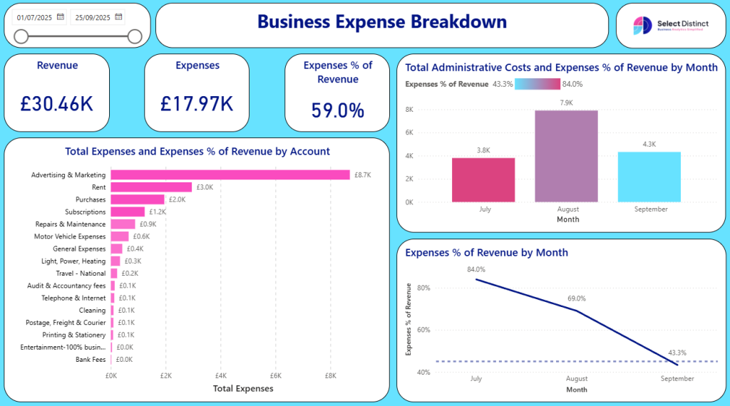
The Solution: A unified P&L and Expense Breakdown suite for operational transparency.
Key Highlights:
Profit & Loss: A clean, monthly view of revenue vs. expenses with automated YTD tracking.
Cost Efficiency: Tracks “Expenses as a % of Revenue” (e.g., identifies spikes like the 84.0% in July) to monitor profitability.
Spend Categories: Visualises top drivers like Advertising & Marketing vs. Rent and Subscriptions.
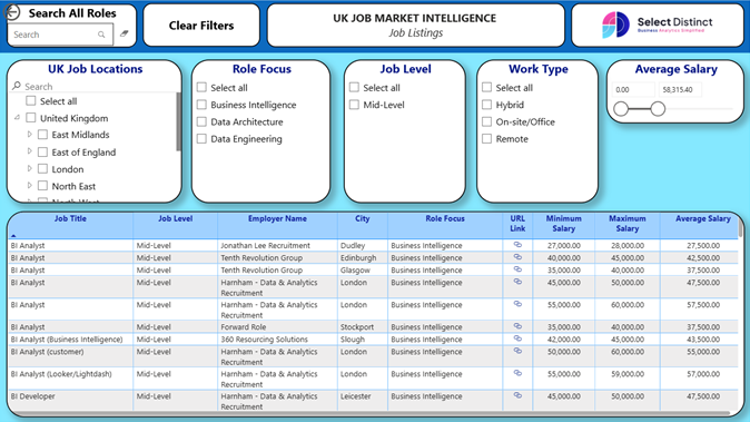
UK Job Market Intelligence Suite
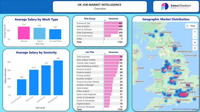
The Challenge: Visualising the fragmented landscape of UK recruitment and salary trends.
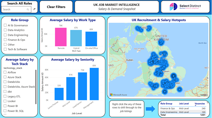
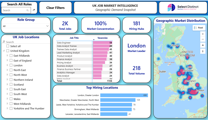
The Solution: A multi-page report that tracks 1,700+ vacancies and provides real-time geographic distribution.
Key Highlights:
Market Hotspots: Interactive heatmaps pinpoint hiring hubs across London, Birmingham, and Manchester.
Salary Benchmarking: Direct comparisons between Remote (£73k), Hybrid (£67k), and On-site (£58k) work models.
Tech Stack Analysis: Tracks demand for specific tools like Databricks and Power BI.
Advanced UI: Includes “Right-click to drill-through” functionality for granular job listing data.
Real-Time Utility Dashboards
The Challenge: Integrating non-standard, live data streams into a business environment.
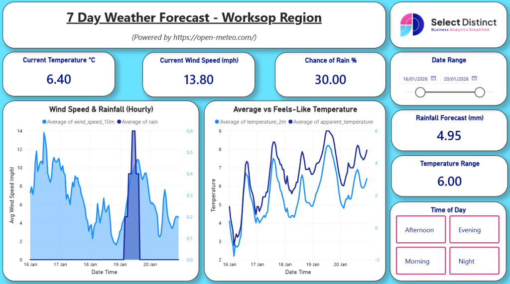
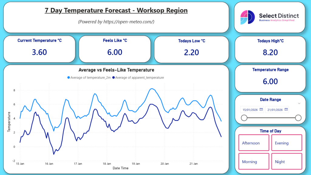
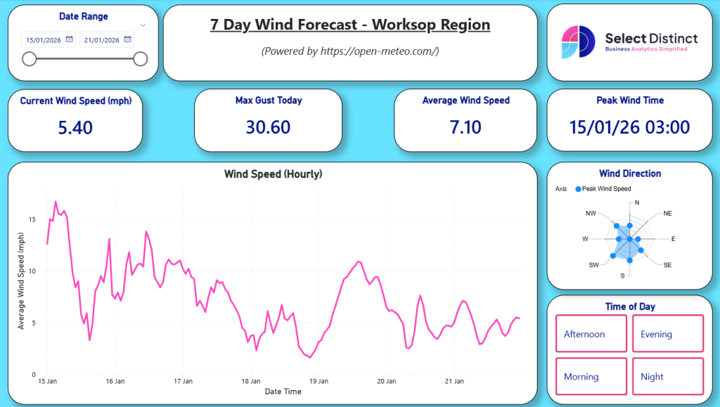
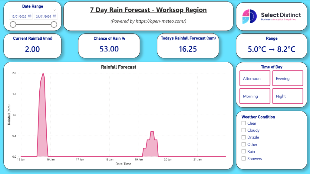
The Solution: An API-driven weather forecast dashboard for regional planning.
Key Highlights:
API Integration: Powered by Open-Meteo to track live wind speed, rainfall, and temperature.
Predictive Visuals: Hourly tracking of “Feels-Like” vs. actual temperature and 7-day rainfall forecasts.
- Dynamic Filtering: Interactive controls allowing users to filter weather metrics by time of day.
Power BI Licensing Calculator
The Challenge: Navigating the complex pricing tiers of Microsoft Fabric and Power BI.
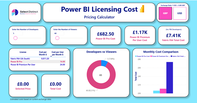
The Solution: A dynamic tool that simplifies procurement decisions for IT leaders.
Key Highlights:
Cost Modelling: Compare Power BI Pro vs. Premium vs. Fabric F64 based on developer and viewer counts.
Currency Toggle: Real-time conversion between GBP and USD based on current exchange rates.
- Visual Breakdown: Interactive donut charts and cost-comparison bars to instantly contrast monthly expenses across tiers.
Try Our Interactive Dashboards
Experience the power of our reporting frameworks first hand. Toggle filters, drill down into data, and see how we simplify complex information.
Live: UK Job Market
Use the map to find recruitment hotspots or filter by ‘Tech Stack’ to see how specific skills impact average salary.
Live: Business Expense & P&L Tracker
Analyse monthly spending trends and see how we visualise ‘Expenses as a % of Revenue’ to drive operational efficiency.
Live: Power BI Licensing Calculator
Input your developer and viewer counts to instantly see the cost difference between Pro, Premium, and Fabric F64.
Live: 7-Day Weather Forecast
Interact with live meteorological data to see how we integrate external REST APIs into a functional Power BI environment. Filter by time of day or track specific trends like wind speed and “feels-like” temperature.
Ready to Build Your Own?
Want a bespoke version of one of these dashboards for your business? Let’s talk.
You can book an introductory meeting directly with Simon Harrison using his the link below.
Starting with a FREE teams call we can find out more about you and your business and begin to understand how we can help you get more from Power BI.